Why a 3D Aesthetics Harness Matters to People Who Post Reels
Let’s be honest: if you spend your days obsessing over TikTok watch time, LinkedIn carousels, and Instagram Story completion rates, a technical tool for game developers—something about “mesh-based generative harnesses”—sounds like it belongs in a completely different universe. But I’d argue it’s the exact opposite. The creator economy has hit a ceiling of flat, template-driven content. We’ve optimized the hell out of hooks, CTA buttons, and posting times, yet the algorithmic distribution is increasingly favoring visual novelty and retention signals that we can’t easily quantify. When I scroll through my feed, I see the same Canva layouts, the same CapCut transitions, and the same “vlog style” B-roll. The differentiation is gone.
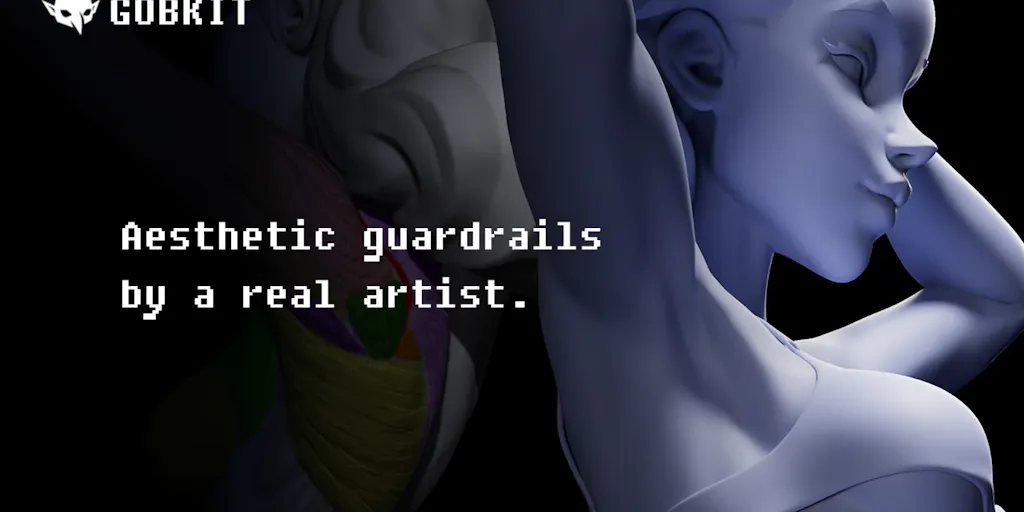
So when I see a tool like anyCreature from maker Ariescar that claims to programmatically enforce “3D aesthetics” through automated pipeline checks, I don’t just see a game-dev utility. I see a potential blueprint for a new kind of creative quality control. It is a system that applies objective, machine-driven thresholds to subjective visual output. For social media operators, that is the holy grail—moving beyond vibes and into verifiable metrics for readability, composition, and engagement potential before we hit publish. This isn’t about making monsters; it’s about understanding how to structure visual information so that a viewer (or an algorithm) can process it instantly. That is a skill that translates directly to thumbnails, cover images, and even video storyboards.
The launch page is a bit of a rabbit hole—it’s framed entirely around game-engine specs and “biologically logical anatomy”—but the underlying philosophy is deeply relevant to anyone who has ever stared at a 24px avatar icon and wondered why it looks like a blob. Let’s break down what this actually means for our workflows, what we can steal from it, and where I think the hype needs a reality check.
The Problem It Actually Solves: The “Looks Fine on My Monitor” Trap
The core problem anyCreature solves is one that plagues every content operation, from solo creators to social media teams at agencies: the lack of objective feedback loops in the creative process. When I schedule 30 posts across 5 platforms in a single sitting, I am making judgment calls based on a 27-inch monitor. I zoom in, I look at the fine details, I convince myself the color grading is perfect. But the actual consumption happens on a 6-inch phone screen, often in a thumbnail size no larger than a postage stamp, and usually while the viewer is scrolling at high speed.
The maker, a Technical Artist, has built a harness that performs three specific checks that I find incredibly transferable:
- QC Thresholds: Automated pass/fail checks for standard game-engine specs like poly count, vertex budget, rigging, and animation tracks.
- Quantified Aesthetics: Spatial vertex analysis to objectively measure mass distribution and form tension.
- Silhouette & Readability: Automated high-contrast B&W renders and 24px thumbnail tests to guarantee visual clarity.
Now, I don’t care about poly counts or vertex budgets. But I care deeply about the concept of a pass/fail check. In the social media world, we call this “does this work in the feed?” Usually, we answer that question with a gut feeling. This tool forces the question to be answered with data. The “Silhouette & Readability” check is the killer feature for us. It mimics the worst-case scenario for your content: a tiny, low-resolution, high-contrast rendering. If your subject matter is indistinguishable from the background at 24px in black and white, it will absolutely fail to stop a thumb on a phone screen.
This is the exact same reason why YouTube thumbnails perform better with high contrast and large, simple shapes. It’s why TikTok’s algorithm favors clear, well-lit faces over cluttered scenes. We spend hours on color palettes, but the algorithm often tests for structure first. This harness is essentially an automated version of the “squint test” that every veteran designer uses. It forces you to strip away the noise and look at the structural integrity of the visual. For a creator, that is invaluable.
How It Differs From the Incumbents
We have a crowded space of content tools. Buffer, Hootsuite, and Later handle scheduling and analytics. Canva and Adobe Express handle design templates. CapCut handles video editing. But none of these tools offer a diagnostic layer for aesthetic quality based on structural analysis. They are production tools, not evaluation tools.
- Canva tells you if your text is cut off, but it won’t tell you if your focal point is lost in a busy background.
- CapCut lets you add effects, but it won’t tell you if your subject’s silhouette is muddy.
- Metricool and Sprout Social tell you what performed well retroactively, but they don’t help you predict performance based on visual composition.
anyCreature sits in a different lane. It’s not a scheduler and it’s not a design tool. It’s a quality assurance harness. It is built for AI agents, meant to be deployed “headless” so that you can prompt it within your active workspace. This is a massive philosophical difference. The incumbents are trying to be the place where you work; this tool is trying to be the standard by which you work. It’s an API for taste.
Of course, the tool is specifically designed for 3D meshes, so it’s not like I can plug my Instagram JPGs into it right now. But the mechanism is what matters. The idea of running automated checks on “mass distribution” is fascinating. In photography, we call it the rule of thirds. In design, we call it visual weight. If you have a character or an object that is too heavy on one side of the frame, the composition feels unbalanced, and viewers subconsciously disengage. The fact that we could one day automate the detection of that imbalance is a game-changer for video storyboarding.
What Creators and Social Media Teams Can Borrow From It (Right Now)
Even though this is a niche tool for 3D artists, the methodology is immediately actionable for social media operators. You don’t need the software to adopt the mindset. Here is what I am taking away from this launch to apply to my own content calendar this week.
1. The 24px Thumbnail Test (The “Silhouette & Readability” Hack)
The most concrete takeaway is the 24px thumbnail test. The maker claims this ensures “visual clarity and instant readability in-game,” but it works just as well for social. I am going to start doing this with every static graphic I create. I will export the design, shrink it to 24px by 24px, and convert it to black and white. If I cannot tell what the image is, or if the text becomes illegible, I redesign it.
This is not just about small screens. It’s about the feed density. When you are on Instagram’s explore page, you are competing with 8 other posts in a grid. Your image is tiny. If it doesn’t have a strong silhouette—meaning the outline of your main subject is clear and distinct—you are invisible. This is why minimal design works so well on Pinterest. It’s why a single, well-lit product shot outperforms a cluttered lifestyle photo. The algorithm detects engagement, but it cannot engage with a blurry mess. By forcing yourself to design for the smallest, worst-case scenario, you guarantee clarity in the best-case scenario.
2. The QC Thresholds Mindset (Pre-Flight Checklists)
The idea of automated pass/fail checks is something we should steal immediately. In social media, we often rely on “I’ll fix it in post” or “it’s good enough.” Instead, I am building a pre-flight checklist for content:
- Aspect Ratio Check: Does this get cropped awkwardly in the feed? (A common fail for 4:5 images on LinkedIn vs. Instagram).
- Text Overlay Check: Is the text overlapping a crucial visual element? Will the “See More” fold hide it?
- Caption Length Check: Is the hook buried in the third sentence?
- Audio Check: Does the trending audio actually match the mood, or is it just there for reach?
This tool automates those checks for 3D, but the principle stands. We need to stop treating publishing as a creative act and start treating it as a logistics act. The creative part is the idea; the publishing part is the quality control. If you can define clear, objective thresholds for your content—like “the logo must be visible in the first 2 seconds” or “the hook must be under 10 words”—you can delegate the production process to junior staff or AI tools with much higher confidence.
3. The “Quantified Aesthetics” Debate (Form vs. Function)
The term “Quantified Aesthetics” sounds like an oxymoron. Aesthetics are subjective, right? But the maker argues that spatial vertex analysis can objectively measure “mass distribution and form tension, ensuring biologically logical anatomy.”
In my experience, this is where the magic happens. The most viral content often feels “off” in a way that is hard to place. It’s not the lighting, it’s not the topic—it’s the composition. The human eye is trained to detect biological anomalies. If a face is slightly too wide, or a product is rendered with the wrong perspective, we get a “creepy” vibe without knowing why. This tool aims to eliminate that uncanny valley effect by ensuring the math behind the form is sound.
For social media managers, the lesson is to pay attention to the geometry of your visuals. If you are using a 3D render of a product, does it look physically stable? If you are using a photo of a person, are their eyes in the upper third of the frame? These aren’t just artistic choices; they are psychological triggers that affect dwell time. A balanced image feels trustworthy. An unbalanced image creates subconscious friction. By quantifying this, we can move beyond “I like it” to “This will perform because the visual weight is correctly distributed.”
Why TikTok Creators Should Care More Than LinkedIn Ones
If you are a LinkedIn text-poster, this tool is irrelevant to you. But if you are a TikTok creator, this is the exact problem you face daily. TikTok’s algorithm is brutal about “completion rate.” If a viewer scrolls past in 0.3 seconds, the video is dead. To stop the scroll, you need a visual hook that reads instantly. You cannot rely on a clever caption because the caption is hidden.
A high-contrast silhouette, a clear subject, and a dynamic but balanced composition are the only things that will save you. TikTok rewards clarity. The “Silhouette & Readability” check is essentially a test for “scroll-stopping power.” If you are creating gameplay clips, 3D animations, or AR filters, this tool is directly applicable. For the rest of us, it’s a reminder that the first frame of your video is a thumbnail. It needs to be a masterpiece of simplicity.
Where My Judgment Says It Falls Short (The Reality Check)
I am excited about the concept, but I have to be honest about the application. This is a niche tool with a steep learning curve. It is not a plug-and-play SaaS for the average social media manager.
The Target Audience is Narrow: The launch page is heavily focused on game-engine specs. If you are a fashion blogger or a food influencer, you will bounce off this harder than a Hootsuite dashboard. The language is technical, the workflow is headless (meaning you need to know how to use APIs and command lines), and the output is 3D models. This is not for the faint of heart.
The “Quantified Aesthetics” Claim is a Stretch: The maker claims to “objectively measure” aesthetics. I call bull—or at least, I call it incomplete. Aesthetics are not purely about mass distribution and anatomy. They are about culture, context, and emotion. A deliberately distorted figure (think Picasso) has terrible “biological logic” but incredible aesthetic value. A tool like this can only measure the rules, not the exceptions. It is a baseline for quality, not a guarantee of creativity. In my experience, tools that try to automate taste often produce sterile, generic output. You still need the human eye to add the soul.
The “10x Your Reach” Trap: The source doesn’t explicitly make this claim, but the general pitch of “automated quality” often leads creators to believe it will fix their engagement. It won’t. If your content is boring, no amount of silhouette optimization will save you. This tool helps you avoid technical mistakes, but it cannot help you with strategic direction. It’s a proofreader, not a ghostwriter.
The Integration Barrier: The team claims it is “natively designed to be fetched and deployed headless.” For an indie founder, that’s fantastic. For a social media manager at a traditional brand, that is a nightmare. We are used to Canva and CapCut where everything is in a browser. The idea of “dropping an open-source harness into your AI Agent” is still too technical for the mass market. It will be a tool for the early adopters and the tinkerers, not for the “growth marketers” who are non-technical.
Where the Math Breaks
The biggest flaw in the “Quantified Aesthetics” logic is the assumption that viewers want biological logic. They don’t. They want novelty. The human brain is wired to notice anomalies. A character with a massive, non-anatomical head (like a Funko Pop) is objectively “wrong” but commercially successful because it’s cute and memorable. If you use this harness to enforce strict realism, you might end up with technically perfect but utterly boring content.
The math checks out for *legibility*—ensuring things are readable and clear—but it fails for emotion. You cannot quantify “cool.” You cannot measure “vibe.” And in the creator economy, vibe is the currency. I would bet that the most viral content on TikTok right now fails the “biological logic” test. It’s weird, it’s distorted, and it’s engaging. So, while I love the idea of QC thresholds, I would caution against using this as a sole arbiter of what gets published. Use it to catch errors, not to define your artistic vision.
What I’d Watch / Test Next
This week, I am going to test the principles of this tool, even if I don’t use the software itself. The Gobkit Community Gallery mentioned in the launch is worth watching—if that community takes off, it will be a great case study in how “AI agents” can generate and share assets with a quality bar.
Here are my concrete next steps for you, the operator:
- Run the 24px Test on Your Top 10 Posts: Go into your analytics, take your top 10 performing images, shrink them down, and convert them to B&W. Compare them against your bottom 10. I guarantee you will see a pattern. The top performers will have cleaner silhouettes. Start applying that filter to your new content before you publish.
- Build a “Pre-Flight” Checklist: Don’t wait for this tool to become accessible. Write down 5 objective criteria for your content (e.g., “Text is legible at 50% zoom,” “Subject occupies 60% of the frame,” “No more than 3 focal points”). Force your team or your VA to run these checks before anything goes live.
- Monitor the AI Agent Integration: The most interesting part of this launch is the “headless” deployment. Keep an eye on how creators are using this with their own AI workflows. If you are an indie founder building an AI tool for content creation, this is a signal that “quality control” is the next frontier. The market is saturated with generation tools; it is starving for evaluation tools.
At the end of the day, anyCreature is a niche product for a specific audience. But the thinking behind it—the desire to automate quality, to quantify aesthetics, and to ensure readability at scale—is exactly where the creator economy is heading. We are moving from “create and pray” to “test and optimize.” The tools might be clunky now, but the direction is clear. Start building your own quality metrics today, before the algorithms force you to.


