The remote-control fantasy every creator quietly shares
Every creator I know has, at some point, built a Rube Goldberg machine out of their own workflow. A phone propped on a tripod, a laptop tethered by a cable, a tablet mirroring a desktop, a Bluetooth clicker bought on a whim and abandoned in a drawer. We tolerate this because the alternative — getting up, walking to the machine, clicking one thing, walking back — feels like a tax on momentum. So when I saw Control My Mac launch on Product Hunt, built by Sebastian Škoić, my first reaction wasn’t “nice accessibility tool.” It was: this is the missing remote control for every creator who films, streams, or edits with a Mac parked somewhere inconvenient. That’s the lens I want to use here — not as a product review, but as a prompt to rethink how your capture and edit setup is physically arranged, because that arrangement silently caps how much you can produce.
What Control My Mac actually does, and why that matters to a creator
The pitch is deliberately narrow. As the maker puts it, he built it because he kept getting up from the couch to click one thing on a Mac mini under the TV. Then he realized other people had far better reasons than laziness: an injury, RSI, a cast, a baby asleep on one arm. The whole product is designed around one finger.
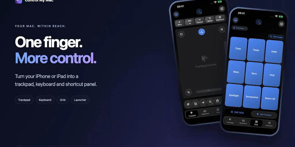
Concretely, your iPhone or iPad becomes four things: a trackpad (move, click, right-click, scroll), a keyboard that works live key-by-key or lets you compose a whole message and send it in one go, a Grid of shortcut buttons that switches automatically depending on which Mac app is in front, and an app launcher plus window switcher.
A few implementation details the maker cared about, per the launch page: no account, no servers, no ads — the phone talks straight to the Mac over Wi-Fi or Bluetooth, encrypted. Pairing is one QR scan, with no IP addresses or firewall fiddling. The Mac app is free, the iPhone app has a free Essentials tier, and the Full App is an optional upgrade with a 7-day free trial and a one-time Lifetime option for people who hate subscriptions.
That’s the whole thing. And on the surface, it has nothing to do with social media. Except it does, and here’s why.
Why TikTok creators should care more than LinkedIn ones
Think about who actually has a Mac sitting at an awkward distance from where they work. Short-form video creators. The person who films themselves talking to camera with the Mac mini under a monitor on a desk across the room. The streamer who needs to start a recording without breaking frame. The editor who wants to scrub a timeline while standing at a standing desk with a client on speakerphone. The solo founder recording a product demo and needing to hit “record” without a five-second scramble.
LinkedIn creators, by contrast, mostly type. A text-first workflow lives on the keyboard already, and a phone-as-trackpad doesn’t change much. So if you’re a short-form video operator, this category of tool deserves more of your attention than it’s getting. If you’re a newsletter-first LinkedIn poster, you can skim the rest.
The problem it solves is not “remote control,” it’s friction at the edges of a take
Here’s the operational reality I keep running into: the expensive part of content production isn’t the middle — it’s the edges. Starting a take. Stopping a take. Restarting a take because you flubbed a line. Checking a reference mid-record. Hitting publish.
Every one of those edge moments is a place where a creator’s momentum can break. And momentum is the actual scarce resource. When I’ve scheduled 30 posts across 5 platforms in a single sitting, the thing that slows me down isn’t the writing — it’s the constant context-switching between the tool I’m writing in and the browser tabs where I’m uploading, tagging, and scheduling. Multiply that friction by a hundred small moments a week and you start to understand why so many creators under-ship relative to their ideas.
Control My Mac attacks a specific flavor of that friction: the physical distance between where you are and where the machine is. It’s not a content tool. It’s a proximity tool. That distinction matters, because the creator economy is full of tools that promise to help you make more content, and very few that quietly remove the small physical taxes that make content production feel heavier than it should.
The “one QR scan, no IP addresses” detail is the real product
I want to dwell on this because it’s the part most reviewers will skip. Anyone who has tried to set up screen mirroring, remote desktop, or a phone-as-input device on a Mac knows the pain: you’re in a settings menu, you’re copying an IP, you’re wondering if your firewall is going to block you, you’re one macOS update away from the whole thing breaking. Apple’s own Continuity features handle some of this beautifully — Universal Control, Sidecar, Handoff — but they’re designed around Apple-to-Apple proximity and they don’t give you a customizable shortcut grid that adapts to the frontmost app.
The maker’s claim that pairing is a single QR scan, with no IP addresses and no firewall changes, is the kind of unglamorous engineering decision that separates a tool you’ll actually use daily from one you’ll set up once and forget. I’d bet — and this is my take, not a sourced fact — that the shortcut Grid, which switches based on which Mac app is in front, is the feature that ends up mattering most to power users. Context-aware inputs are how you get from “novelty” to “reflex.”
How this compares to the tools you’re probably already using
Let me place it against the incumbents, because that’s how you decide whether it earns a slot in your stack.
If you’re already using Buffer, Hootsuite, Later, or Metricool for scheduling and analytics, you know these tools live in the cloud and in your browser. They solve distribution. They don’t solve capture. Control My Mac is orthogonal to them — it doesn’t compete with your scheduler, it sits underneath your recording and editing layer.
If you’re using CapCut or Canva for editing, same story. Those are where the content gets shaped. Control My Mac is where the content gets initiated.
The closest real comparison is Apple’s Universal Control, which lets you drive a Mac with an iPad’s trackpad and keyboard when the two are near each other. It’s genuinely excellent, and it’s free if you own both devices. But it doesn’t give you a customizable shortcut Grid, it doesn’t give you a “compose the whole message then send it in one go” keyboard mode, and it assumes you want the iPad as a second screen, not as a dedicated remote. There’s also the world of dedicated macro pads and stream decks — physical hardware like the Elgato Stream Deck — which many creators swear by. Those are great if you want tactile buttons and you’re willing to spend $150+ and keep another device charged on your desk. Control My Mac’s bet is that the phone already in your pocket is the remote you should be using, and that software can do what hardware does without the hardware.
My take: those are two different philosophies, and both are defensible. A Stream Deck is a permanent fixture for someone whose whole workflow is desk-based. A phone-as-remote is for the creator who moves around, films in different rooms, and doesn’t want yet another device to charge.
Where the pricing math gets interesting
The source says the Mac app is free, the iPhone app has a free Essentials tier, the Full App is an optional upgrade with a 7-day free trial, and there’s a one-time Lifetime option. It does not disclose the actual price of the Full App or the Lifetime tier — so I won’t invent numbers.
What I can say is that the structure itself is a signal. Free Mac app plus freemium iPhone app plus a lifetime option is the shape of a tool that wants to be tried casually and kept permanently. Compare that to the subscription-first model most creator SaaS defaults to — Buffer’s pricing tiers, for example, or the various per-seat plans you’ll find across the scheduling category — and the “one-time Lifetime option if you hate subscriptions (me too)” line reads as a deliberate positioning move. Whether it’s a good deal depends entirely on the number, which we don’t have.
What creators and social media teams can borrow from this
Even if you never install Control My Mac, the thinking behind it is worth stealing.
First: audit your physical friction. Walk through your last recording session and count how many times you had to physically move to make something happen. Every one of those is a candidate for automation or a remote input. Some you’ll solve with software, some with hardware, some with a $12 Bluetooth clicker. The point is to notice them at all.
Second: context-aware shortcuts beat static ones. The Grid that switches based on the frontmost Mac app is a design pattern every creator should apply to their own tooling. If you’re building a Notion dashboard for your content calendar, build different views for different phases — ideation, scripting, filming, editing, publishing. If you’re using Airtable for your content ops, do the same. The tool should know what phase you’re in and show you only what’s relevant.
Third: the phone in your pocket is an underused input device. Most creators think of their phone as a camera and a publishing surface. Almost nobody thinks of it as a controller. If you’re running a Mac-based studio, the phone-as-remote idea is worth exploring beyond just this one product — Apple Shortcuts can trigger Mac actions, and various third-party apps bridge the two.
Fourth: “no account, no servers” is a trust feature, not a technical footnote. For creators who handle client work, unreleased footage, or anything under NDA, the fact that the phone talks directly to the Mac over Wi-Fi or Bluetooth, encrypted, with no server in the middle, is a meaningful differentiator. It’s the kind of thing you should be asking about every tool that touches your content pipeline.
Where I think it falls short, and who it’s not for
Let me be honest about the limits, because the launch page doesn’t dwell on them and a good operator needs the full picture.
It’s Mac-only and iOS-only. The source describes the Mac app and the iPhone/iPad app. There’s no mention of Windows, Android, or a web version. If your studio runs on Windows or your phone is Android, this product does not exist for you. Not disclosed whether other platforms are on the roadmap.
It’s a single-machine tool. The source doesn’t describe multi-Mac management, team features, or shared configurations. For a solo creator, that’s fine. For a social media team with three editors and four machines, there’s no obvious way to standardize the setup across people. Not disclosed.
The shortcut Grid is only as good as your willingness to configure it. Context-aware buttons that switch per app are powerful, but they require you to actually set them up. If you’re the kind of creator who never customizes keyboard shortcuts, you’ll get less out of this than someone who does. This is my read, not a claim from the maker.
Accessibility is the stated origin story, but the launch page doesn’t detail accessibility certifications. The maker names injury, RSI, a cast, and a sleeping baby as motivations. That’s a genuine and important use case. But “designed around one finger” is not the same as “WCAG-compliant” or “tested with assistive tech.” If accessibility is your primary need, I’d want to see more specifics before treating this as a solution. Not disclosed.
The category has a graveyard. Phone-as-remote-control apps have existed for years, and most die from neglect — they break on OS updates, they stop working when the developer moves on, and users quietly abandon them. The lifetime pricing option is a nice signal of commitment, but it’s not a guarantee. I’d bet the real test of this product is whether it’s still shipping updates in eighteen months. That’s my judgment, not a sourced fact.
Who should skip this
If you work entirely on a laptop that’s always within arm’s reach, this solves a problem you don’t have. If your content is text-first and your publishing workflow is browser-based, the friction it removes isn’t your bottleneck. If you’re on Windows or Android, it’s not available. And if you’re looking for a tool that will help you make better content rather than reach your machine more easily, this isn’t that — it’s infrastructure, not creative leverage.
What I’d watch / test next
Here’s what I’d actually do this week if I were evaluating this for a creator workflow.
One: Install the free Mac app and the free Essentials tier on your phone, and run one real recording session with it. Don’t test it in isolation — test it inside an actual take, where the friction either helps or hurts. The 7-day free trial on the Full App is enough runway to know whether the Grid earns its keep.
Two: Before you upgrade, write down every moment in a normal editing session where you physically leave your seat. That list is your personal ROI calculation. If it’s three moments, the free tier is probably enough. If it’s thirty, the Full App is likely worth it — but only you can price that.
Three: Test the pairing claim yourself. The maker says it’s one QR scan with no IP addresses or firewall changes. If that holds up on your network, it’s a strong signal about the engineering quality. If it doesn’t, that tells you something too.
Four: If accessibility is your primary motivation, reach out to the maker directly before committing. The launch page invites exactly that — “I’d really like to hear how you’d use it and what’s missing. I’m reading every comment today.” Take him up on it. Ask specifically about assistive tech compatibility, because the source doesn’t say.
Five: Watch the update cadence. A tool like this lives or dies on whether it survives the next two macOS releases. Check back in a quarter. If it’s still shipping, it’s probably a keeper. If it’s gone quiet, you’ll have saved yourself a lifetime purchase you’d regret.
The bigger takeaway for social media operators isn’t this specific product. It’s the reminder that your production capacity is shaped as much by your physical setup as by your strategy. You can have the best content calendar in the world and still under-ship because your Mac is six feet away and your phone is in your hand. Tools like Control My Mac are worth noticing not because they’re flashy, but because they quietly remove a tax you’d stopped noticing you were paying.


