The Accessibility Gap Is a Distribution Problem, Not Just a Compliance Problem
If you run social for a brand, you already know the feeling: a campaign ships, the landing page loads, the checkout flow works for you, and everyone declares victory. Then a creator replies in your comments saying they couldn’t complete the signup with a screen reader, or a customer emails saying the promo code field traps their keyboard focus, and suddenly a “successful launch” is a support ticket. Accessibility is usually framed as a legal checkbox owned by engineering. I’d argue it’s a growth and reputation problem that social and content operators feel first, because we’re the ones fielding the fallout in public. That’s why DevAlly’s latest launch caught my eye — not because I’m an accessibility engineer, but because the failure mode it targets is the exact one that turns a smooth funnel into a public complaint thread.
What DevAlly Agent Actually Does (and Why It’s Not Another Scanner)
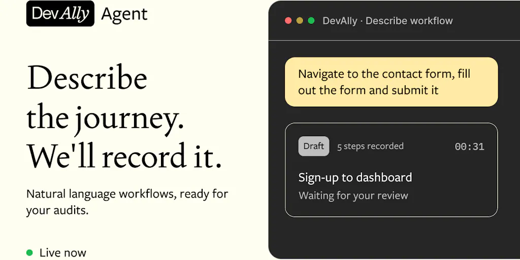
The core pitch from DevAlly CEO and co-founder Cormac Chisholm is deceptively simple: you describe a user journey in plain English — something like “go to the contact page, fill out the form and submit it” — and the DevAlly Agent walks through your site the way a real user would, handling cookie banners, asking you for sign-in credentials when it needs them, and recording the entire journey. You then review the recorded steps and a replay, confirm it’s correct, and from that point on DevAlly audits that journey continuously, returning every issue with the WCAG success criterion it fails and a recommended fix that can be pushed straight to your editor via the DevAlly MCP.
The launch page frames the core insight well: WCAG’s conformance rules say that if a page is part of a process, every step of that process has to conform. A checkout that’s 90% accessible is a checkout someone can’t finish. Yet these multi-step flows are, as the team puts it, “the least tested part of most products” — because testing them has historically meant either clicking through every step by hand or writing scripted tests that break every time the UI changes.
If you’ve ever managed a product marketing site, you know this pain intimately. I’ve watched teams spend a full sprint auditing a homepage’s color contrast while the actual signup modal — the one thing every paid campaign drives toward — had a focus trap that made it unusable for keyboard users. The homepage passed. The funnel didn’t.
Why this matters more to performance marketers than to engineers
Here’s my take, and it’s the reason I’m writing about a dev tool on a social-media blog: the people who feel accessibility failures most acutely aren’t the engineers who get the bug ticket. They’re the paid social buyers watching a campaign’s conversion rate look mysteriously soft, and the community managers absorbing angry DMs. When I’ve run UTM-tagged campaigns pointing at a landing page, a broken form step doesn’t announce itself as an accessibility bug — it just shows up as a lower conversion rate, a higher cost per acquisition, and a bunch of “your site is broken” comments that nobody can reproduce because the reporter is using a screen reader and the tester isn’t. DevAlly’s journey-based approach is interesting precisely because it tests the thing performance marketers actually pay for: the path from click to conversion, not the static page.
How It Differs From the Incumbents You Already Know
The accessibility testing space isn’t empty. axe from Deque, WAVE from WebAIM, and Pa11y are the names most teams reach for, and they’re genuinely good at what they do: static page scans that flag missing alt text, insufficient contrast, unlabeled form fields. If you’ve ever run a Lighthouse audit in Chrome DevTools, you’ve used accessibility checks baked into the browser.
What those tools mostly don’t do is walk a journey. They check a page in isolation. DevAlly’s bet — and the team is explicit that this is the differentiator — is that the barriers stopping a disabled user from finishing a task “commonly live between the pages”: the modal that traps keyboard focus, the error message a screen reader never announces, the session timeout nobody can extend, the payment step that only works with a mouse.
This is a meaningful distinction, and it maps onto a broader shift I’ve been watching across the tooling landscape. The last two years have been about moving from “scan the artifact” to “simulate the user.” You see it in QA tools, in synthetic monitoring, and now in accessibility. The question is whether simulating a user is actually reliable enough to trust — and that’s where the Product Hunt thread gets genuinely interesting.
The brute-force problem, and why the human review step matters
Google Cloud Run’s Sara Ford, who says she worked on accessibility and Section 508, asked the sharpest question in the thread: could the agent “brute-force” a solution — routing around an inaccessible button by jumping straight to the next URL — and thereby never report a real WCAG bug?
DevAlly’s Head of Product Bruno Walraven answered this directly, and the answer is the most important design detail in the whole launch: the agent only records the journey, it never judges it, and you as the domain expert verify every recorded Workflow before it’s saved. A detour gets caught at human review rather than baked into the test. He also noted there’s no separate system prompt to edit — the journey description is the instruction, and you can be as prescriptive as you like: “go to the pricing page, open the Pro plan, add it to the basket, check out as a guest.”
That human-in-the-loop design is, in my experience, the difference between an AI tool you can trust and one that quietly generates confident nonsense. I’ve tested enough agentic browser tools to know that the failure mode is rarely “it can’t do the task” — it’s “it did a task, just not the one you meant, and reported success.” Requiring a human to confirm the recorded path before it becomes a recurring test is a sensible guardrail.
What Social and Content Teams Can Steal From This
Even if you never touch DevAlly, the underlying methodology is worth borrowing. Here’s what I’d take from it.
Think in journeys, not pages
Most content and social teams audit their assets page by page. A landing page gets reviewed, a form gets reviewed, a thank-you page gets reviewed — each in isolation by a different person. DevAlly’s framing suggests the opposite: define the journey a user takes from your campaign to conversion, and test that path end to end. For a creator running a lead magnet, that’s: ad click → landing page → email form → confirmation → welcome email. For an indie founder, it’s: social post → pricing page → checkout → onboarding. The barriers hide in the transitions, not the destinations.
Borrow the “describe it in plain language” workflow for your own QA
I’ve started doing a low-tech version of this on accounts I manage: writing out, in plain sentences, the exact path a user should take from a given post to a given outcome, then walking it myself on a phone, on desktop, with a keyboard only, and with a screen reader if I can. It takes twenty minutes and catches things that no analytics dashboard will ever surface. The plain-English description forces you to be honest about what the intended path actually is — which is often the first time anyone on the team has written it down.
Treat accessibility as a content-reputation issue
When a creator with a disability posts a video about how your signup flow locked them out, that video can outperform your own campaign content. I’ve seen this dynamic play out across TikTok and Instagram — accessibility complaints are highly shareable because they’re concrete, personal, and verifiable. The reputational math is brutal: one viral “I couldn’t use your product” clip can outweigh months of paid acquisition. Framing accessibility as a brand-safety issue, not just a legal one, is how you get it onto the marketing team’s roadmap instead of languishing in a backlog.
Where My Judgment Says This Falls Short
I want to be balanced here, because the launch page is promotional and the team is honest about limits — which I respect.
First, the agent doesn’t support hover-only menus, drag-and-drop interactions, or iframes yet. The team says the agent tells you upfront if a journey needs one of those rather than silently recording something that breaks, which is the right behavior, but it does mean a meaningful chunk of modern web UX is currently out of scope. If your product relies heavily on drag-and-drop — think Canva or CapCut-style editors — this isn’t going to cover your core flows.
Second, and more importantly: DevAlly does not replace a human audit. The team says this explicitly, and Darren Britton, the CTO, was candid that they’d “be wary of any tool that claims to.” Questions like whether alt text is actually meaningful, or whether a flow makes sense with a screen reader, still need a person. So if you’re buying this hoping to check a compliance box and move on, you’ll be disappointed — and possibly exposed, because automated checks that pass don’t guarantee a genuinely usable experience.
Third, the pricing beyond the free tier isn’t disclosed on the launch page, and neither are any usage limits on the beta. The agent is in beta and open to every DevAlly user including the Free plan, with no waiting list — which is generous, but beta terms change. I’d want to know the rate limits before I built a workflow dependency on it.
Who this is not for
If you’re a solo creator with a single-page Linktree-style site and no multi-step funnel, this is overkill. If you’re on a platform that handles accessibility for you — a hosted storefront, a Substack newsletter — your exposure is lower. And if your team has no one who can actually fix the issues the agent surfaces, you’ll just accumulate a list of problems you can’t act on. The tool is most valuable to teams that ship frequently, have real multi-step funnels, and have engineering capacity to act on findings.
What I’d Watch / Test Next
This week, I’d do three concrete things regardless of whether you ever sign up.
First, pick your single highest-value funnel — the one your paid campaigns drive to — and write out the journey in plain English, step by step. Then walk it yourself with a keyboard only. No mouse. See how far you get. That exercise alone will tell you whether you have a problem worth solving.
Second, if you want to test DevAlly specifically, the free tier is open with no waiting list, so there’s low cost to recording one journey through your own product and seeing what it catches. Compare its findings against a manual WAVE scan of the same pages — the delta between page-level and journey-level findings is the whole point of the product, and you’ll learn something either way.
Third, watch the platform regulation landscape. The team frames WCAG as the testing standard but notes users are usually trying to demonstrate compliance with whichever regulation applies to them — the European Accessibility Act, ADA, Section 508. As those enforcement regimes tighten, accessibility stops being a nice-to-have and becomes a distribution risk. I’d bet the creators and operators who internalize journey-based testing now will be the ones who don’t get blindsided when a compliance deadline or a viral complaint arrives. The tooling is finally catching up to the problem. The question is whether your workflow will.


