The feedback loop that social teams keep losing (and why a point-and-click annotation tool matters more than it sounds)
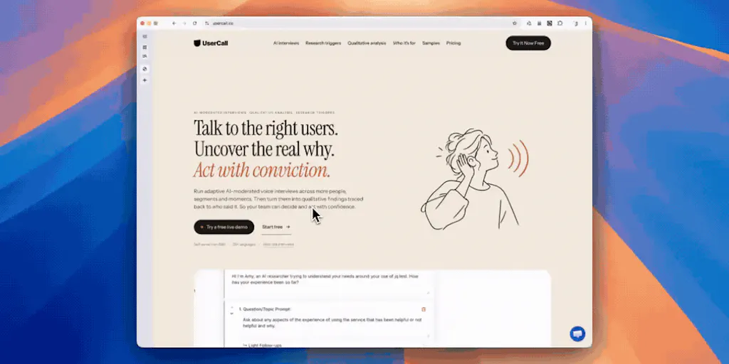
Most social media operators I know don’t have a content problem. They have a review problem. The creative is done, the caption is written, the thumbnail is exported — and then it sits in a Slack thread or a Notion doc or a Google Sheet while three people describe, in words, which button is misaligned, which frame is off-brand, or which CTA sits too low in the safe zone. That’s the invisible tax on every publishing calendar: not the making, but the describing. UserCall, a new feedback tool launched by maker Junu Yang, is aimed squarely at that gap. The pitch, in short: let a reviewer click the exact element they mean, batch the notes, and send them back as one consolidated pass instead of a drip of “actually, can you also…” messages. If you run social accounts at any real volume, that’s a workflow worth understanding — because the bottleneck in creator operations is rarely the algorithm. It’s the revision loop.
What UserCall actually solves, and why it’s a social-media problem in disguise
On the surface, UserCall reads like a website-feedback tool — the kind of thing a product team uses to QA a landing page. And it is. But the mechanic underneath is exactly what social teams need more than almost any other vertical, because social is the one channel where every asset is a visual with dozens of micro-elements that all have to be right at once.
Think about what a single Instagram carousel or TikTok cover actually contains: a headline, a subhead, a logo lockup, a face, a hook line, a progress indicator, a CTA, a branded color, a safe-zone margin, and a caption that has to match all of it. When a brand manager reviews that asset, they can’t point at the third slide and say “this word.” They say “the one on the right, under the thing.” That’s how revision cycles stretch from one day to four.
The mechanic UserCall is leaning on — click the element, attach the note, batch the notes — is the same reason Loom took off for async video feedback and why Markup.io became a default for design reviews. The insight is that spatial feedback beats verbal feedback every time. A reviewer who can point at the actual card or button, as one commenter on the launch thread put it, “saves a lot of describing which one you mean.” That’s not a UX nicety. That’s hours per week, per campaign, per operator.
Why TikTok creators should care more than LinkedIn ones
Here’s where I’d push back on the generic “feedback tool” framing. The value of point-and-click annotation scales directly with how visual and fast-moving the asset is. A LinkedIn text post needs almost no spatial feedback — the reviewer either likes the copy or doesn’t. A TikTok video with a hook overlay, a caption, a sound, and a stitched reply needs feedback on five layers at once, and the reviewer usually can’t articulate which layer is wrong.
So my take: if you’re a short-form-first creator or a social team running TikTok and Reels at volume, a tool like this is closer to a must-try than a nice-to-have. If you’re mostly publishing text to X or Threads, you can probably keep doing what you’re doing. The math changes the moment your output becomes visual and multi-layered.
How it stacks up against the incumbents you’re already paying for
Let’s be honest about the competitive set, because “another feedback tool” is a crowded category and creators are already drowning in SaaS subscriptions.
The obvious comparison is Markup.io, which has owned the “annotate any URL or asset with a comment” space for years. There’s also Pastel for website review, BugHerd for dev-adjacent visual feedback, and the async-video crowd led by Loom. On the social side, the closest thing most teams use today is Frame.io — which Adobe owns — for video review, plus a mess of Slack threads, Notion pages, and Google Docs comment threads for everything else.
What UserCall is betting on isn’t a feature nobody has. It’s a workflow shape — point at the element, batch the notes, send them as one pass — that’s cleaner than stitching together three tools. The launch thread hints at the real technical question here, and it’s a good one: how do you map a clicked element back to its source when the underlying markup uses hashed class names from Tailwind or CSS modules? That’s the kind of detail that separates a demo from a tool you’d actually run a 30-post week through. I’d want to see how it handles dynamic content, lazy-loaded images, and iframe-embedded media before I trust it on a live campaign page.
Where the math breaks
Here’s the operational reality nobody puts in a launch post: annotation tools are only as good as the reviewer’s willingness to use them. In my experience running review cycles across a dozen clients, the failure mode is never the tool. It’s the VP who refuses to leave the tool and sends a Slack message anyway, or the client who replies to the batched notes with a fresh PDF marked up in Preview. The tool has to be faster than the lazy alternative, not just faster than the disciplined one.
That’s the bar UserCall has to clear. If batching notes into a single send — which the launch thread explicitly calls out as a “thoughtful touch” — actually reduces the back-and-forth, it wins. If it just adds another tab to the review, it doesn’t.
What creators and social teams can borrow from this, regardless of whether they adopt it
Even if you never sign up for UserCall, the workflow logic underneath it is worth stealing this week. Three things I’d lift directly:
1. Batch your feedback. The single biggest time-saver in any review cycle is consolidating notes into one pass instead of a drip. If you’re a social manager fielding feedback from a founder, a designer, and a client, force the batch. One doc, one send, one revision. The launch thread’s emphasis on batching is the right instinct — it’s also the thing most teams skip because it feels slower in the moment.
2. Point, don’t describe. Whether you use a dedicated tool or just Loom with your cursor, spatial feedback beats verbal feedback. A 40-second screen recording pointing at the exact frame is worth more than a paragraph describing it.
3. Separate “must-fix” from “nice-to-have.” The reason review cycles balloon is that every note gets treated as blocking. If your annotation tool lets you tag severity, use it. If it doesn’t, do it manually in the batched send. This is the difference between a 24-hour turnaround and a four-day one.
The repurposing angle nobody’s talking about
Here’s where I’d extend the tool’s logic beyond its stated use case. Social teams don’t just review new assets — they review repurposed ones. The same TikTok gets cut into a Reel, a Short, a Pinterest Idea Pin, and a LinkedIn video. Each version has slightly different safe zones, caption lengths, and aspect ratios. A tool that lets a reviewer point at the exact element that’s wrong in the repurposed version — the caption that’s now cut off, the CTA that’s now under the UI — is solving a problem that gets worse every time you multiply your distribution.
This is the part I’d bet on long-term: not “feedback for websites,” but “feedback for the multi-platform content matrix.” That’s a bigger and more defensible market than another Markup competitor.
Where my judgment says it falls short
Now the honest part, because I don’t write launch coverage that pretends every tool is a category-defining moment.
First, the source is thin on specifics. The Product Hunt thread shows genuine engagement — a commenter asking about element mapping, the maker replying — but there’s no disclosed pricing, no user count, no integration list, no API details, and no clear statement of which platforms or asset types are supported. “Not disclosed” is the honest answer on all of those, and any operator evaluating this should treat the launch page as a starting point, not a spec sheet.
Second, the category is crowded and the differentiation is workflow-shaped, not feature-shaped. Markup.io, Pastel, and BugHerd all do variations of this. The batching angle is real, but it’s not a moat — it’s a UX choice that any competitor can copy in a sprint. My take: the defensibility here comes from integrations (does it push notes into Asana, Linear, Slack, Notion?) and from handling the messy reality of dynamic, hashed-class, iframe-heavy modern web pages. The launch thread’s element-mapping question is the right question, and I’d want the answer before recommending it to a team.
Third, it’s not for everyone. If you’re a solo creator publishing to one platform, you don’t need this — you need a better caption hook and a consistent posting schedule. If you’re a two-person social team with a weekly review call, you probably don’t need this either. The tool earns its keep when you have three or more stakeholders reviewing multi-element visual assets across multiple platforms on a recurring cadence. Below that threshold, the overhead of adopting a new tool outweighs the saved describing time.
Fourth, the platform-risk question. Any tool that sits on top of social platforms is exposed to the same API and policy shifts that have wrecked scheduling tools before. Buffer, Hootsuite, and Later have all had to rebuild parts of their stack when Instagram, TikTok, or X changed their API terms. If UserCall eventually wants to pull assets directly from social platforms for review, it inherits that risk. If it stays platform-agnostic and just reviews uploaded files or live URLs, it sidesteps it. The launch material doesn’t say which direction it’s heading — and that’s a question worth asking the maker directly.
What I’d watch / test next
If you’re a social media manager, creator, or growth operator reading this, here’s what I’d actually do this week — no signup required:
Test the batch-feedback workflow manually first. Before you evaluate any tool, run one review cycle where you force every stakeholder to send notes in a single consolidated pass, with each note pointing at a specific element. Measure how many revision rounds it takes versus your last campaign. If the number drops, you’ve validated the problem — and now a tool like UserCall has a clear ROI case.
Ask the maker three questions. One: how does element mapping work on pages with hashed class names (the exact question raised in the launch thread)? Two: what integrations exist for Slack, Asana, and Notion? Three: what’s the pricing, and is there a free tier for solo creators? The launch page doesn’t answer any of these — “not disclosed” across the board.
Watch the repurposing use case. If UserCall or a competitor ships a workflow specifically for reviewing the same asset across multiple platform formats — TikTok cut, Reel cut, Short cut, Pinterest cut — that’s the version I’d actually pay for. That’s where the describing tax is highest and where existing tools like Frame.io and Markup.io are weakest.
And keep your review stack boring. The creators who ship the most aren’t the ones with the fanciest tooling — they’re the ones with a review loop so simple that nobody skips it. Whether that loop runs through UserCall or a shared doc with timestamps, the discipline matters more than the software. Tools like this are only worth adopting if they make the disciplined path the easier path. That’s the test I’d apply before adding another subscription to the stack.


