The real product here isn’t app blocking — it’s friction design, and social teams should study it
Most social media operators I know have a complicated relationship with the tools they use to publish. We schedule, we batch, we repurpose, we analyze — and then we open the apps again “just to check” and lose forty minutes to the feed. That’s not a discipline problem, it’s a design problem: the platforms are engineered to remove every last tap between impulse and dopamine, and the blockers we install to fight back are engineered with the same philosophy. Tap “Ignore Limit.” Tap “Remind Me in 15 Minutes.” Done. Latch: Scan to Unlock is interesting to me not because it’s a screen-time app — there are dozens — but because its maker has correctly diagnosed the failure mode and built the opposite: a blocker whose entire mechanism is distance. For anyone whose job is to publish on Instagram, TikTok, and X without being eaten alive by them, that’s worth a close look.
What Latch actually is, and the problem it’s really solving
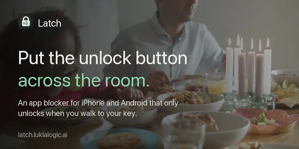
The pitch from maker Sudarshan is disarmingly honest: “Screen Time limits never worked for me because I could tap past them in a second. What worked was distance.” That’s the whole thesis. Latch locks the apps you choose, and the everyday way back in is to scan a physical key — a cheap NFC sticker, a printed QR code, or a step count. You can keep one at home, one in the car, one at work. The app is available on iPhone, iPad, and Android, and the maker says Pro costs $9.99 as a one-time purchase that never renews, with a “break glass” escape hatch of three emergency unlocks per month before it re-locks itself.
Notice what’s absent from that paragraph: accounts, analytics, ads. The maker explicitly says there’s no account, no analytics, and no ads, and that on iPhone, Apple’s Screen Time hides your blocked apps even from Latch. That last detail matters more than it looks. Most third-party blockers on iOS are built on top of Screen Time’s API, which means the blocker can see which apps you’ve selected — a privacy surface most users never think about. Latch is claiming it can’t, by design.
The comparison set is obvious and crowded: Opal, one sec, Freedom, Brick, and the native Screen Time and Digital Wellbeing tools. A Product Hunt commenter, Adrian Knoll, asked the fair question directly: “Many of those apps/solutions already exist. What’s unique about Latch?” The answer, as far as I can tell from the launch page, is the physical-key mechanic plus the pay-once model plus the privacy stance. Whether that’s enough to win is a separate question — more on that below.
Why the physical key is the actual innovation
I’ve tested a lot of blockers over the years, and the pattern is always the same: the friction you add at setup evaporates at the moment of temptation, because the unlock path lives on the same device as the temptation. A PIN you memorized is not friction. A Face ID scan is not friction. A sticker in the kitchen is friction, because it requires a change of physical state — standing up, walking, locating a thing. The maker’s line, “when the thing that unlocks my phone is in the kitchen, I usually decide I don’t need Instagram that badly,” is the most useful sentence on the page. That’s not willpower; that’s environment design, and it’s the same principle behind every good content workflow I’ve ever built.
How this maps onto the way social teams actually work
Here’s where I stop reviewing a consumer app and start talking to operators. If you run social for a brand or you’re an indie founder publishing your own stuff, your relationship with these platforms is structurally different from a normal user’s. You have to be in the apps — to check comments, to see how a Reel is performing in the first hour, to respond to a DM that’s actually a sales lead. You can’t just block Instagram wholesale; that’s your job. So the interesting question isn’t “should I block TikTok,” it’s “which surfaces of TikTok do I need, and which ones are stealing my afternoon?”
That’s where the “lock the apps you choose” framing gets useful. In my own workflow, the split I’d want is roughly: publishing and analytics via desktop tools like Buffer, Later, or Metricool, and the native apps reserved for the specific tasks that genuinely require them — replying to comments, checking a trending sound, verifying a post rendered correctly. Everything else is the feed, and the feed is where the time goes. A tool that lets me lock the app and unlock it only when I’m at my desk, with my phone’s key sticker taped to the monitor, is a workflow intervention disguised as a wellness app.
The repurposing angle nobody talks about
The reason friction matters more than ever is that the repurposing load has exploded. A single piece of content now needs to be cut for CapCut shorts, resized for Canva carousels, rewritten for LinkedIn and Threads, and pinned for Pinterest — and every one of those platforms has its own native editor it wants you to use. The result is that operators spend their day bouncing between apps, and each bounce is an opportunity to get sucked into the feed. The more platforms you publish to, the more surface area you have for distraction. Latch doesn’t solve repurposing, but it addresses the second-order cost of doing it natively: the app-hopping tax. I’d bet the operators who feel this most acutely are the ones running five or more accounts, not the ones running one.
Why TikTok creators should care more than LinkedIn ones
A quick sidebar, because the platform mix changes the calculus. LinkedIn is a feed you can mostly ignore between posts; the algorithmic pressure is lower, the session lengths are shorter, and the content is text-forward enough that you can draft in a doc and paste it in. TikTok is the opposite: the app is designed for long, lean-back sessions, the sound library is a genuine research tool, and the “just one more” pull is strongest there. If you’re a short-form creator, TikTok is simultaneously your most important distribution channel and your biggest time sink. That’s the profile that benefits most from a physical key — not because you should stop using TikTok, but because you should be using it with intent, in bounded sessions, rather than ambiently. YouTube Shorts has a similar pull; Pinterest less so, despite its own rabbit-hole tendencies.
What creators and social teams can borrow from the design
Even if you never install Latch, there are three ideas in this launch worth stealing for your own workflow.
One: friction beats willpower, so design your defaults. The maker’s insight is that the unlock path should be inconvenient by design. You can apply the same logic without a blocker: log out of the apps you don’t need on your phone, delete the ones you only use on desktop, and keep the publishing tools on a separate home screen from the consumption tools. The point isn’t deprivation; it’s making the intentional path the easy one and the accidental path the hard one.
Two: pay-once is a positioning choice, not just a pricing one. The $9.99 one-time price is a deliberate contrast with the subscription norm in this category — Opal and Freedom are subscription products, and so are most of the scheduling tools we use daily. For a utility this small, pay-once is a trust signal: it says the maker isn’t incentivized to keep you hooked on the tool itself. That’s a lesson for anyone selling to creators, who are notoriously subscription-fatigued. My take: the pay-once model is the single most underrated part of this launch.
Three: privacy as a feature, stated plainly. “No account, no analytics, no ads” is three words of copy that do a lot of work, especially in a category where the blocker needs deep access to your app usage. The claim that Apple’s Screen Time hides blocked apps even from Latch is the kind of specific, verifiable-sounding detail that builds trust — and it’s the kind of thing I’d want to see verified independently before I’d rely on it. The maker is asking the right question in the launch thread: “what would make you trust a blocker like this?” That’s a good instinct, and it’s the question every privacy-forward tool should be answering in public.
Where my judgment says it falls short
Now the balanced part, because a launch page is a sales document and I’ve been burned by enough of them to read skeptically.
The step-count key is underspecified. Commenter Neeraj Nathany asked the exact question I had: if you pick steps as your key, do steps you already walked earlier in the day count, or only the ones taken after you try to open a blocked app? The launch page doesn’t say. That distinction is the difference between a meaningful friction mechanic and a trivial one — if yesterday’s steps count, the key is basically free. Not disclosed, and it matters.
The lost-key scenario is a real operational gap. Adam Petritsis asked: “What if I lose the NFC sticker? Can I pair a new one without being unlocked already?” Also not answered on the page. For a tool whose entire value proposition is a physical object, the recovery path is not an edge case — it’s a core UX question. The “break glass” three-unlocks-per-month escape hatch is a partial answer, but it’s a monthly budget, not a recovery flow. If I’m trusting a blocker with my phone’s usability, I want to know exactly how I get back in when the sticker ends up in the laundry.
The category is crowded and the differentiation is thin on paper. Adrian Knoll’s comment is the one I’d take most seriously if I were the maker. Brick already does the physical-tag unlock; one sec does the friction-on-open thing with a breathing exercise; the native tools are free and improving every OS cycle. Latch’s edge is the combination — physical key plus pay-once plus privacy — but combinations are easier to copy than single features. My take: the moat here is the maker’s taste and the trust he builds in the launch thread, not the mechanic itself.
And the big one: this is a consumer wellness tool, not a social media management tool. It doesn’t schedule, it doesn’t analyze, it doesn’t repurpose, it doesn’t track UTMs or surface engagement rate. If you came here looking for a publishing workflow upgrade, this isn’t it. It’s a complement to your stack, not a replacement for any part of it. I’d be wary of anyone framing it as a “creator productivity” tool — that’s a stretch.
Where the math breaks
The three-emergency-unlocks-per-month design is clever, but it has a predictable failure mode: the month you actually need a fourth unlock is the month you’re traveling, or on deadline, or dealing with a family thing — exactly when you’re least able to walk to the kitchen. The maker’s own framing (“a way out when you really need it”) suggests he’s thought about this, but a hard monthly cap on emergencies is a blunt instrument. I’d want to see how it behaves at the boundary before trusting it with anything important.
What I’d watch / test next
If you’re an operator reading this, here’s what I’d actually do this week, in order. First, audit your own app-hopping: for three days, note every time you open a social app and whether it was for a publishing task or a consumption task. You’ll probably find the ratio is worse than you think — mine was. Second, if the ratio is bad, try the cheapest version of the Latch idea before you buy anything: move the apps you don’t need to a buried folder, log out of the ones you only use on desktop, and put a physical barrier (even just “phone stays in the other room while I draft”) between you and the feed during deep-work blocks. Third, if that works and you want the real thing, the maker is offering Pro free while codes last via the launch page’s free-Pro link, which is a low-risk way to test the mechanic. Fourth, watch the launch thread for answers on the step-count and lost-key questions — those are the two details that determine whether this is a real tool or a clever demo. And fifth, keep it in perspective: Latch is a friction layer for the consumption side of your social life, not a replacement for the scheduling and analytics stack that actually runs your publishing operation. The operators who get the most out of it will be the ones who already have the publishing side handled and are now optimizing the attention side. That’s the real lesson of this launch, and it’s a lesson worth more than the $9.99.