The Notch Is the New Dock: Why the Most Unlikely Real Estate on Your Mac Is Becoming a Creator Workspace
If you spend your working life inside a social media manager’s dashboard, you know the feeling: your browser has 47 tabs open, your desktop is a graveyard of half-edited video thumbnails, and the only thing between you and a published post is a frantic scramble across five different apps. We’ve built our entire workflow around the margins of our screens—the dock, the menu bar, the notification center. We’ve turned every pixel of our digital real estate into a potential trigger for a workflow. So when I saw a tool that wants to turn the MacBook’s notch—that piece of hardware we all pretend doesn’t exist—into a functional command center, my first thought wasn’t “gimmick.” It was “finally, someone is looking at the one part of the screen we’ve all been ignoring.”
This isn’t about a cute widget. For creators and social media operators, the notch represents the last frontier of passive utility. We are a demographic that lives in the liminal space between content creation and content distribution. We need system stats while rendering video, a quick calendar glance while scheduling a month of posts, and a calculator that doesn’t require us to open a separate app and lose our flow state. The pitch for NotchDrop v2 is that it turns a hardware inconvenience into a software advantage. This matters because our attention is the most valuable asset we have, and any tool that reduces the friction between “idea” and “published” is worth a hard look. This isn’t a press release; it’s a field test of a concept that could change how we think about the periphery of our workstations.
The Problem: We’ve Optimized Everything Except the Dead Zone
Let’s be honest about the state of the creator workflow in 2026. We have an embarrassment of riches when it comes to scheduling and analytics. Tools like Buffer and Hootsuite have solved the “when to post” problem. Canva solved the “how to make it look good” problem. CapCut solved the “how to edit it fast” problem. But there is a silent killer of productivity that none of these SaaS giants have addressed: the context switch. When I’m in the middle of cutting a 60-second YouTube Short and I need to check if my CPU is thermal throttling, I have to leave my editor, open Activity Monitor, and then navigate back. That’s a 10-second interruption that breaks a creative flow that took 20 minutes to build.
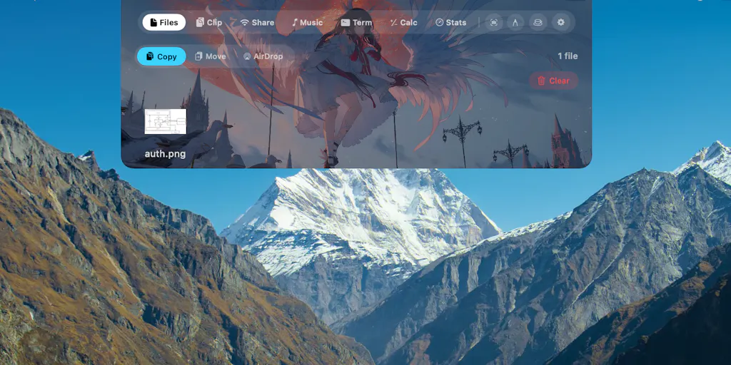
The problem NotchDrop is attacking is the “glanceability” deficit. We don’t need more powerful apps; we need more accessible data. The menu bar is cluttered, the dock is for launching, not monitoring. The notch, however, is a persistent piece of screen real estate that we’ve mentally blocked out. The maker, Muhammad Saddam Nur, seems to have realized that this dead zone is prime property. By turning the notch into a Dynamic Island-style interface, he’s effectively creating a heads-up display for your Mac. For a social media operator, this is the difference between having to dig for system stats and having them presented to you at the edge of your vision while you’re deep in a comment moderation rabbit hole.
This is a subtle but significant shift. It’s not about adding more features; it’s about surfacing existing data in a location we’ve already trained our eyes to ignore. The features listed—System Stats, Calendar, Calculator—aren’t new. But their location is. It’s the difference between a kitchen where the spices are in a cabinet and a kitchen where they’re on a magnetic strip above the stove. The latter doesn’t make you a better cook, but it makes you faster, and in the world of trend-jacking and real-time engagement, speed is a competitive advantage.
How NotchDrop v2 Differs From the Incumbents (and Why It’s Not a Widget)
When I first saw the launch, my immediate comparison was to the widget stacks in macOS or the utility apps that live in the menu bar. But there’s a fundamental difference in philosophy. Widgets are pull-based—you have to click to expand them, and they sit in a grid that requires scanning. Menu bar apps are pull-based too, often hiding behind a cluttered icon cluster. The Dynamic Island approach is push-based and contextual. It uses the physical hardware cutout as a frame, making the information feel native to the device rather than bolted on.
This is where the “Expertise” part of the equation kicks in. In my experience testing similar utilities like iStat Menus or Bartender, the issue is always visual noise. They give you everything all the time. NotchDrop v2, based on the feature list, seems to be aiming for a more modular approach. The inclusion of NotchDrop Studio and a redesigned Notch Terminal suggests they’re moving beyond simple glanceable stats and into a “quick action” zone.
For a creator, the Draw Signature feature is a sleeper hit. I can’t tell you how many times I’ve had to approve a contract or sign a release form for a brand deal and had to open Preview, find the markup tool, and awkwardly draw a signature with a trackpad. Having that action live in the notch is a massive quality-of-life improvement. Similarly, local file sharing and AirDrop integration in the notch makes sense for a workflow that involves shuttling large video files between an iPhone and a Mac. It’s not replacing Dropbox or Google Drive, but it’s a faster hand-off for the final mile.
The biggest differentiator, though, is the Calendar integration. As someone who juggles content calendars across Notion, Google Calendar, and platform-specific schedulers, having a glanceable calendar that isn’t a full-screen widget is useful. It’s about reducing the cognitive load of “what’s next?” Without switching context, I can see that I have a live stream at 2 PM and a newsletter draft due at 4 PM. It’s ambient awareness, and for a social media manager who is constantly context-switching between strategy and execution, ambient awareness is gold.
What Creators Can Borrow From the “Notch” Philosophy
This launch isn’t just about a Mac utility; it’s a lesson in resourcefulness. The core thesis—”the MacBook notch takes up space anyway, so why not make it useful?“—is a mindset that creators should apply to their own content strategy. We often look at our limitations (time, budget, equipment) as dead zones. This product is a reminder that the constraints we’re ignoring might be the most valuable assets we have.
Here’s the operational takeaway: Repurpose the dead space. In the same way NotchDrop turns a hardware cutout into a workspace, creators should look at their “dead content”—the blooper reels, the unused B-roll, the off-topic thoughts—as a Dynamic Island for their brand. That unused footage can become a Threads post. That off-hand comment in a podcast can be a LinkedIn carousel. The most successful creators aren’t the ones with the most tools; they’re the ones who find utility in the spaces everyone else ignores.
Why TikTok Creators Should Care More Than LinkedIn Ones
This is where I’ll get specific. The value of a tool like NotchDrop is heavily skewed toward a specific type of creator. If you’re a LinkedIn thought-leader who writes text posts in a web browser, this app offers marginal utility—you probably don’t need system stats while typing a 500-word post about leadership. But if you’re a TikTok or Instagram creator who is editing video, rendering effects, and live-streaming, this tool is almost purpose-built for you.
When you’re live on Instagram, your Mac is working hard. You need to monitor CPU temperature to ensure you don’t thermal throttle and drop frames. You need a Keep Awake feature to ensure your Mac doesn’t sleep during a long stream. You need a quick calculator to figure out engagement rates on the fly during a Q&A. The notch becomes a mission control for the live creator. For the text-based creator, it’s just a fancy clock. This isn’t a criticism of the tool; it’s a clarification of the target persona. The maker might have built a general utility, but the power users will be the video-first operators.
Where the Math Breaks: My Honest Assessment of the Shortfalls
Now, let’s get to the part where I earn my keep as a skeptical industry observer. While I love the concept, there are several limitations that give me pause, and any social media operator should be aware of them before integrating this into their daily workflow.
First, the screen real estate paradox. On a 13-inch MacBook Air, the notch is a small sliver. Cramming a “workspace” into it sounds great, but the physical space is limited. The Notch Terminal is a brilliant idea, but how much code can you realistically see in a 200-pixel-wide drop-down? This is a classic case of feature creep. The simpler features—System Stats, Keep Awake, Calendar—are likely to be far more useful than the heavy-duty ones like a Terminal or Studio. My take? The maker is trying to do too much in a space that is inherently constrained. The sweet spot is glanceable data, not a full-blown application suite.
Second, the monetization and sustainability question. The source doesn’t disclose pricing or a business model. The launch page mentions it was launched previously in January 2026, and this is v2. This suggests an indie developer iterating quickly. But for a social media operator, this is a risk. We build our workflows around tools. If I start using the NotchDrop Calendar as my primary glanceable calendar and the developer abandons the project in six months, I’ve lost time. I compare this to the stability of Later or Metricool, which are established businesses. NotchDrop is a utility, and utilities need constant maintenance to keep up with macOS updates. This is a “use at your own risk” tool for your peripheral workflow, not your core stack.
Third, the “gimmick” threshold. I’ve tested Dynamic Island clones on Windows and various menu bar apps. The novelty wears off. The question is whether the utility persists. For the first week, you’ll love seeing your CPU stats in the notch. By week three, will it still be there, or will you have hidden it to reclaim the visual space? The features like Live Wallpaper seem like pure distraction. As an operator, I need tools that fade into the background, not ones that add visual noise to my screen. The “Draw Signature” and “AirDrop” features are the ones with staying power because they solve a recurring, annoying problem. The rest might just be novelty.
The Operational Workflow: How I’d Actually Use This
Let me paint a picture of how this tool fits into a realistic day for a social media manager. It’s Monday morning. I’ve got a content calendar to review, a video to edit for a client, and a live stream to prep for the afternoon.
With NotchDrop, my morning looks like this: I glance at the notch to see my system stats—RAM usage is high because I have Premiere Pro and Chrome open, but CPU is stable. I check the Calendar in the notch—I see I have a 10 AM check-in and a 2 PM live stream. I don’t need to open a separate app. I use the Calculator to quickly add up the total time for a batch of 15-second ads to ensure they fit a 60-second slot. When I need to sign a model release form that just came in via email, I use the Draw Signature feature in the notch instead of hunting through the Preview app. The friction of the mundane is reduced.
This is the promise. It’s not about doing more; it’s about doing the small things faster. The local file sharing feature is a godsend for the hand-off between my phone and my Mac. I can AirDrop a video from my iPhone directly to the notch, and it’s there waiting for me when I switch to my editing software. It effectively creates a temporary holding pen at the top of my screen.
But here is the counterpoint that keeps me grounded. When I scheduled 30 posts across 5 platforms last month, I didn’t need a notch to do it. I needed Planable or a similar tool for collaboration. When I analyzed my YouTube retention graphs, I didn’t need a notch; I needed vidIQ or TubeBuddy. The notch is for the micro-interactions, not the macro-strategy. If you understand that distinction, this tool is a delight. If you expect it to replace your scheduling dashboard, you’ll be disappointed.
Where the Math Breaks: The Multi-Display Creator
Here’s a specific scenario where this tool is a hard pass: the multi-monitor setup. If you’re a creator running a MacBook Pro in clamshell mode connected to a 32-inch monitor, the notch is physically closed. You don’t see it. The Dynamic Island experience is nullified. This tool is exclusively for the laptop-first creator who uses the built-in display. For the desktop studio creator, this is irrelevant. The maker hasn’t addressed this in the launch, and it’s a significant blind spot. The creator economy is split between the “coffee shop warrior” and the “home studio hermit.” NotchDrop is built for the former, and it leaves the latter out in the cold.
What I’d Watch / Test Next
I’m not going to dismiss NotchDrop as a toy, but I’m also not going to call it a revolution. It’s a clever, well-executed utility that addresses the “glanceability” problem. Here’s what I’d do this week if you’re intrigued:
- Test the “Glanceable” features, not the “Workspace” ones. Download the app and immediately try the Keep Awake and System Stats features. These are the ones that will save you time during rendering or live streams. Ignore the Terminal and Studio for now—those are power-user features that are likely too cramped in the notch.
- Map it to your “micro-friction” points. For the next two days, take note of every time you open a utility app (Calculator, Calendar, Activity Monitor) for a quick look. If you do this more than 5 times a day, this tool will pay for itself in saved time. If you rarely do it, you’re not the target user.
- Compare it to your current menu bar setup. If you’re already using a robust menu bar manager with stats, ask yourself if the notch location is truly better or just different. The novelty of the location might wear off, but the utility of the data remains. In my experience, the best tool is the one you forget you’re using—if the notch draws attention to itself, it’s a distraction, not a tool.
The bottom line is that NotchDrop v2 is a signal of a larger trend: the fight for the periphery of our digital attention. As creators, we should watch this space closely. The tools that win our loyalty won’t be the ones with the most features, but the ones that integrate most seamlessly into the physical reality of our hardware. The notch is a constraint, but as NotchDrop proves, constraints are just opportunities in disguise. It’s not a must-have for every operator, but for the laptop-bound, video-editing, live-streaming creator, it’s a compelling argument that the best workspace is the one you already have.


