The Fridge Magnet School of Product Design: What a Poop-Tracking Slider App Taught Me About Content Operations
Every social media manager I know is drowning in a paradox: we have more tools than ever, yet the feeling of actually making progress has never been more elusive. We schedule 30 posts across five platforms, we automate our repurposing pipelines, we let AI draft the first pass of captions — and at the end of the week, we still feel like we’ve been pushing a boulder up a hill that’s somehow made of other boulders. The dashboard says “published,” but the dopamine never lands. It’s all abstract, all intangible, all happening in a flat, infinite scroll of rectangles.
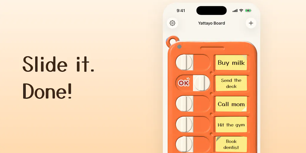
That’s why a tiny, solo-built iPhone app called Yattayo caught my eye on Product Hunt this week. It’s not a scheduling tool, not an analytics platform, not an AI content engine. It’s a to-do list. But it’s a to-do list designed around a physical metaphor: an orange plastic slider checklist, the kind you’d stick on a fridge and flip when a chore is done. The maker, Ryo Tsuzukihashi, rebuilt that board as a real 3D object on your phone. Every task is a slider you drag. It clicks like a ratchet. It thunks at the end. An “OK” stamp lands when you’re done.
And I can’t stop thinking about it — not because I need another task manager, but because it exposes a gap in how we think about the creator economy. We obsess over distribution, algorithm shifts, and engagement rates, but we’ve completely neglected the interface of our own workflow. We’ve optimized for output while ignoring the psychological mechanics of input. Yattayo, in its small, weird way, is a reminder that the tools we use to manage our content operations shape not just what we produce, but how we feel about producing it. And in a world where burnout is the leading cause of creator churn, that feeling is a competitive advantage.
The Real Problem: Content Management Has No Tactile Feedback Loop
Let’s be honest about the state of social media management in 2025. The incumbent tools — Buffer, Hootsuite, Later — are all essentially database front-ends. You have a calendar grid, a queue, a list of posts with timestamps and statuses. The interaction model is: click a button, wait for a spinner, see a checkmark. It’s functional, but it’s flat. There’s no resistance, no feedback, no sense that you’ve actually moved something from one state to another. It’s the digital equivalent of a spreadsheet with a nicer skin.
The problem this creates for social media operators is subtle but profound: we lose the ability to feel progress. When I’m managing content for a brand, I might have 40 pieces of content in various stages — ideation, drafting, design, approval, scheduling, published. In a traditional tool, that’s a list of rows with status tags. But status tags don’t feel like anything. They don’t click, they don’t thunk, they don’t stamp. The result is that the act of moving a post from “draft” to “scheduled” becomes a purely cognitive exercise. It requires mental energy to register that something has changed, and over a long week, that mental energy is exactly what runs out.
Yattayo’s approach — building a real 3D object with physics-based interactions — is a direct challenge to that flatness. The maker’s description is telling: the slider “clicks like a ratchet on the way and thunks at the end,” and an “OK” stamp lands when the task is done. That’s not a gimmick. That’s a deliberate attempt to reintroduce kinesthetic feedback into a domain that has been stripped of it. In my own tests of similar tools, I’ve found that the physicality of an interaction changes how I perceive the underlying task. When I drag a slider and feel that click, my brain registers completion as a sensory event, not just a data change. It’s the difference between reading “task complete” and feeling it.
Now, I’m not suggesting you ditch your content calendar for a 3D slider board. But the underlying insight — that the mechanics of your workflow tool affect your psychology — is directly transferable. When you’re building a content operation, you’re not just building a pipeline; you’re building a system that has to keep you and your team motivated through the grind. Most tools ignore that dimension entirely.
How Yattayo Differs From the Scheduling Giants (and Why That Matters)
To understand why Yattayo is more than a novelty, it helps to put it next to the tools we actually use. The scheduling and automation SaaS space has consolidated around a few core features: calendar views, drag-and-drop scheduling, auto-posting via API integrations, and analytics dashboards. Metricool, Publer, and Ayrshare (for the API-fluent among us) all operate in this lane. They solve the logistics problem — getting content from your head to the platform — but they don’t solve the motivation problem.
Yattayo is not trying to solve the logistics problem at all. It’s a personal task manager, not a team collaboration tool. But its design philosophy — the “physical-feeling UI” that the maker explicitly asks about — is a critique of the entire category. The question Ryo poses in the launch post is the one every tool builder should be asking: “worth the effort, or just a gimmick?”
My take: it’s worth the effort, but not for the reason you think. The “gimmick” framing assumes that the physical metaphor is a visual flourish — a skin on top of the same old list. But Yattayo’s widget is the real tell. The maker notes that “the widget shows the real board, so you can slide a task done without opening the app.” That’s not just a convenience feature; it’s a fundamental rethinking of what a widget is for. Most widgets are information displays — they show you the weather, a calendar, a stock price. Yattayo’s widget is an interactive control surface. You can complete a task without ever entering the app’s main interface. The friction of opening an app, navigating to the right list, and tapping a checkbox is eliminated. The task is right there, on your home screen, and you just… slide it.
For social media operators, this is a lesson in reducing friction at the point of action. We spend so much time optimizing the publishing pipeline — the moment content goes live — that we forget about the micro-interactions that happen dozens of times a day. Checking a task off a list, moving a post from “draft” to “review,” marking a comment as “handled.” Each of these is a tiny cognitive load. Over a day, that load accumulates. A tool that makes these micro-interactions faster and more satisfying isn’t just a nicer UX; it’s a cognitive ergonomics upgrade.
The comparison to the incumbents is stark. Buffer and Hootsuite are built for scale — they handle team workflows, approval chains, and bulk scheduling. They’re essential for agencies and brands managing multiple accounts. But they’re also heavy. Every interaction requires context-switching: open the app, find the post, click the dropdown, select the status. Yattayo doesn’t compete with these tools; it competes with the feeling of using them. It’s a reminder that the best tool for a job isn’t always the most powerful one — sometimes it’s the one that makes you want to do the job at all.
What Creators and Social Media Teams Can Borrow From a 3D Slider
Let me be clear: I’m not telling you to replace your content calendar with a personal to-do app. But there are three concrete lessons from Yattayo that you can apply to your own operation this week.
First, build tactile checkpoints into your workflow. The reason Yattayo’s slider works is that it creates a physical marker of progress. You’re not just looking at a list; you’re interacting with an object that changes state. In your content operation, this translates to having clear, tangible milestones that you can “feel” as you hit them. For example, when I’m managing a content sprint, I don’t just track “posts published.” I track “drafts written,” “graphics approved,” “captions finalized,” and “scheduled.” Each of those is a separate, tactile checkpoint. The problem is that most tools make these checkpoints invisible — they’re just status labels in a database. The fix is to make them visible and interactive. Use a kanban board with physical cards, or a habit tracker with a streak counter, or even a literal whiteboard with sticky notes. The goal is to create a feedback loop that your brain registers as progress, not just data.
Second, optimize for the widget, not the app. Yattayo’s widget is the killer feature because it eliminates the barrier between intention and action. In social media management, the equivalent is reducing the steps between “I have an idea” and “the idea is captured.” Most of us use a notes app or a draft folder, but that’s still a multi-step process: open the app, create a new note, type the idea, tag it, file it. The friction is low, but it’s not zero — and over a month, that friction adds up to lost ideas. The fix is to create a capture mechanism that’s as close to zero-friction as possible. For me, that’s a dedicated Slack channel where I can send voice memos to myself. For you, it might be a widget on your phone’s home screen that opens directly to a new draft. The point is to make the first step of your workflow so easy that you never skip it.
Third, reconsider the role of “fun” in your tooling. The maker’s question — “worth the effort, or just a gimmick?” — is really a question about whether delight has a place in productivity tools. My answer is a resounding yes, but with a caveat: delight only matters if it reduces friction or increases motivation. A slider that clicks is delightful because it makes the act of completing a task more satisfying. A calendar with confetti animations is delightful because it rewards progress. But a tool that’s fun to use but doesn’t help you get more done is a toy, not a tool. When you’re evaluating your social media stack, ask yourself: does this tool make me want to use it, or does it just make me able to use it? The former is a competitive advantage; the latter is table stakes.
Where the Math Breaks: Limitations, Open Questions, and Who Should Skip This
I’ve been singing Yattayo’s praises, but let me be balanced here. This is a solo build, and it shows — in both good and bad ways. The app is free for up to 3 tasks, which is a smart freemium hook, but it also means the free tier is functionally useless for anyone managing a real content pipeline. I need to track more than three things in my first five minutes of using a tool. The pricing for the full version is not disclosed in the launch post, which is a red flag for anyone who hates surprises in their monthly subscription bill.
More importantly, the app is Apple-only. It syncs across iPhone, Apple Watch, and Mac over iCloud, but there’s no mention of Android or web support. For a solo creator working across devices, that’s a dealbreaker. I live in a cross-platform world — my phone is Android, my laptop is a Mac, and my tablet is an iPad. A tool that locks me into one ecosystem is a non-starter, no matter how satisfying the slider feels.
There’s also the question of scale. Yattayo is designed for personal task management, not team collaboration. There’s no mention of shared boards, assignees, or approval workflows. For a social media team of three or more, this tool is irrelevant. You need something like Asana or Trello for that. Yattayo is for the solo creator, the indie founder, the one-person marketing department. And even then, it’s a complement to your existing stack, not a replacement. You’re not going to schedule your Instagram posts from a 3D slider board. But you might use it to manage your personal content creation tasks — the ideation, the drafting, the editing — before they hit your scheduler.
The biggest open question, though, is whether the “physical-feeling UI” is sustainable. The maker asks if it’s worth the effort, and I think that’s the right question. There’s a reason most apps are flat: it’s cheaper, faster, and more accessible to build. 3D physics, haptic feedback, and custom animations are expensive to develop and maintain, especially for a solo developer. The risk is that the novelty wears off, and users are left with a task manager that’s slower than a plain list because of the animations. In my experience, that’s the fatal flaw of most “delightful” productivity tools: they prioritize feel over function. Yattayo’s slider might feel great, but if it takes longer to drag a task to completion than it does to tap a checkbox, the tool is a net negative for productivity.
Why TikTok Creators Should Care More Than LinkedIn Ones
The value of a tool like Yattayo isn’t uniform across the creator economy. If you’re a LinkedIn thought leader, your content workflow is probably pretty linear: write a post, maybe schedule it for a specific time, and that’s it. The feedback loop is the engagement you get — likes, comments, reposts. You don’t need a physical slider to feel progress; the platform gives you that feedback in real time.
But if you’re a TikTok or Instagram creator, your workflow is fundamentally different. You’re producing volume — multiple pieces of content per day, each with its own lifecycle of ideation, scripting, shooting, editing, and posting. The feedback loop is delayed; you post a video and then wait hours for the algorithm to decide whether to show it to anyone. In that gap, the feeling of progress is hard to come by. You’ve done the work, but you don’t have the engagement to prove it yet. A tool that gives you a tactile sense of completion — a slider that clicks, a stamp that lands — can be the difference between feeling productive and feeling like you’re shouting into the void. That’s why the feeling of Yattayo matters more for high-volume, short-form creators than for low-volume, long-form ones.
Where the Math Breaks: The Cost of Delight
Here’s where my skepticism kicks in. The maker claims the slider “clicks like a ratchet on the way and thunks at the end.” That’s a beautiful description, but it’s also a performance claim. Every animation, every haptic, every physics calculation is a cost — in battery, in rendering time, in development effort. For a solo builder, that cost is borne entirely by one person. The question isn’t whether the physical UI is delightful; it’s whether the delight pays for itself in terms of user retention and task completion. The team claims it’s worth it, but there’s no data in the launch post to back that up. In my experience, delightful UI without functional payoff is a one-week novelty. Users will show it to their friends, then quietly delete it when the animations start to feel slow. The challenge for Yattayo is to prove that the physical metaphor improves task completion rates, not just user satisfaction scores. Until then, it’s a beautiful experiment, but not a proven solution.
Who This Is NOT For (and Why That’s Fine)
Let me be direct: if you’re running a social media operation with more than one person, Yattayo is not for you. It’s a personal task manager, and it doesn’t have the collaboration features that a team workflow requires. No shared boards, no assignees, no approval chains. You’ll get more value from ClickUp or Monday.com for team coordination.
If you’re an Android user, it’s also not for you — there’s no Android version mentioned in the launch post. And if you’re someone who hates the idea of a “physical-feeling” UI, who prefers the efficiency of a plain text list, you’ll find the animations and haptics to be pure friction.
But here’s the thing: this tool isn’t trying to be for everyone. It’s a solo build, and it’s explicitly designed to solve a specific problem for a specific type of person — someone who misses the tactile satisfaction of a physical checklist and wants that feeling on their phone. That’s a niche, but it’s a real niche. And in a market where every new social media tool is trying to be the next Canva or CapCut, there’s something refreshing about a tool that’s unapologetically small and focused.
What I’d Watch / Test Next
Here’s what I’m going to do this week, and what I’d suggest you try too:
Download Yattayo and test the slider. The free tier supports up to 3 tasks, which is enough to evaluate the core interaction. Pay attention to how you feel when you drag a task to completion. Does it register differently than a checkbox? Does it make you want to complete more tasks? If yes, that’s a signal that your current workflow is missing a tactile feedback loop. If no, the physical UI is indeed a gimmick — for you, at least.
Audit your own workflow for friction points. Look at the tools you use daily — your scheduler, your notes app, your task manager. Identify the one interaction you do most often (e.g., moving a post from “draft” to “scheduled”) and ask: is this as fast as it could be? Is there a widget, a shortcut, or a keyboard command that could eliminate a step? The goal is to reduce the cognitive load of every micro-interaction, not just the big ones.
Build a “tactile checkpoint” into your content pipeline. This doesn’t have to be a 3D slider. It could be a physical whiteboard, a habit-tracking app with a streak counter, or even a simple spreadsheet with conditional formatting that turns a row green when a post is published. The point is to create a sensory marker of progress that your brain registers as completion. Test it for a week and see if your motivation changes.
Watch the widget space. Yattayo’s widget is the most interesting part of the product, and it’s a sign of where productivity tools are heading. Interactive widgets that let you complete actions without opening the app are the next frontier. Keep an eye on how Notion and Things evolve their widget strategies — if they start adding interactive controls, that’s a signal that the industry is converging on this insight.
The creator economy is obsessed with the external — the algorithm, the engagement rate, the follower count. But the most important interface is the one between you and your own work. Yattayo is a tiny, weird reminder that the tools we use to manage our output shape our ability to keep producing. Sometimes the most productive thing you can do is find a tool that makes the act of doing feel good again.


