The Particle UI Trend Is a Trap for Most Social Teams — But a Goldmine for a Few
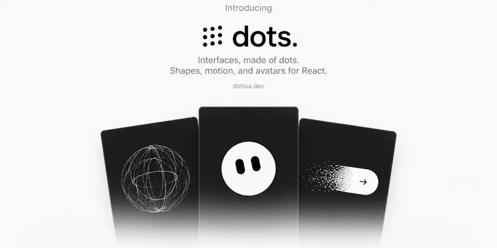
Every few months a new interface library trends on Product Hunt, and every few months I watch social teams try to bolt it onto their content workflow because it “looks cool in the demo.” The launch of Dots UI — a React library of 171 morphing particle shapes from maker Hamza Al Sorkhy — is exactly the kind of thing that will get screenshotted into a dozen “design inspiration” bookmarks and then never shipped. That’s a shame, because the underlying idea (state-driven motion that replaces static icon swaps) maps surprisingly well onto problems social operators actually have: animated end cards, branded loading states for link-in-bio pages, motion assets for Reels and Shorts that don’t require a motion designer. The catch is that most of you don’t build React apps, and the ones who do are usually the ones least likely to need another dependency. So let’s separate the signal from the hype.
What Dots UI Actually Is (and Isn’t)
Strip away the launch-page polish and here’s the substance: Dots UI is a React component library built around a particle system that can morph one shape into another. The maker says it started as “a visual experiment” and grew into 171 shapes across AI, productivity, media, commerce, and navigation categories. You drop the components into a React app, control them like normal UI elements, and adjust particle count, motion, size, and behavior. There’s also a Studio for creating custom shapes and exporting them into your project. It’s free to explore and use, with a pro tier that unlocks more shapes and configurations — pricing for that pro tier is not disclosed on the launch page.
What it is not: a design tool, a video generator, a Canva plugin, or anything that produces an MP4 you can drop into CapCut or Adobe Express. It’s a developer-facing library. If you’re a social media manager who doesn’t touch code, Dots UI is not going to change your week. If you’re an indie founder running your own landing page and link-in-bio, or you work with a dev on your content site, it might.
The interesting design question the maker is solving isn’t “how do I add particles.” It’s “how do I make state transitions feel continuous instead of jarring.” That’s a real problem. When a form submits, most apps swap a spinner for a checkmark — two unrelated assets. Morphing one particle cloud into another preserves spatial continuity, which is why motion designers have used this trick in broadcast graphics for years. Bringing it into React as a component is a legitimate convenience play.
Why this matters more for landing pages than for feeds
Here’s the operational reality: social platforms compress, re-encode, and often strip motion fidelity from anything you upload. A subtle particle morph that looks gorgeous in a browser at 60fps will look like mush after Instagram re-encodes it for Reels, and it’ll look like worse mush on a mid-range Android viewing a TikTok feed on cellular data. So the highest-value use case for Dots UI is not feed content — it’s the owned surfaces you control end-to-end: your link-in-bio page, your newsletter signup, your app onboarding, your webinar registration page. Those are the places where a delightful micro-interaction compounds, because you’re not fighting a platform’s compression pipeline.
How It Compares to the Rest of the Stack
If you’re evaluating Dots UI, you’re probably already comparing it to something. The honest comparison set:
- Framer Motion — the default choice for React animation. Mature, well-documented, huge community. It handles layout animations, gestures, and orchestration beautifully. It does not ship a particle system, so if you want morphing dots you’re building that yourself.
- Rive — a design-and-runtime tool for interactive vector animation. You design in a dedicated editor, export a runtime, and drive it with state machines. This is the closest philosophical cousin to Dots UI’s Studio, but Rive is far more mature and has a real ecosystem of designers who can hand you assets.
- Lottie — the workhorse for shipping After Effects animations to web and mobile. Not interactive in the same way, but if your goal is “play a nice animation when the page loads,” Lottie is lighter weight and better supported.
- Three.js — the full 3D toolkit. Overkill for icon morphs, but if you’re already in a 3D context, you’d rather stay there than add a second rendering paradigm.
My take: Dots UI’s differentiation is narrow but real. It’s not competing with Framer Motion on general animation; it’s competing with “I guess I’ll build a custom canvas particle system.” For a solo dev who wants morphing icons without writing that system from scratch, 171 pre-built shapes is a meaningful head start. For a team that already has a motion designer using Rive, there’s no compelling reason to switch.
The accessibility pushback is the most important comment on the page
One Product Hunt commenter, Gal Dayan, raised the objection that matters most: when a loading state or button is made of particles instead of a plain shape, you risk users with prefers-reduced-motion enabled and screen reader users “both getting nothing useful”. That’s not a nitpick. It’s the central design tension of the whole category. The maker hasn’t publicly answered that thread on the page, so as of this writing the reduced-motion fallback story is unclear. If you’re considering Dots UI for anything user-facing, that’s the first question to ask before you ship.
I’ve watched teams get burned by this exact pattern. You ship a gorgeous animated state change, QA passes on a MacBook Pro, and then a week later you get a support ticket from someone on a two-year-old Android whose loading spinner never resolved because the particles hadn’t rendered yet. Motion is a progressive enhancement, never the primary signal.
What Social Teams Can Actually Borrow From This Launch
Even if you never install Dots UI, there are three transferable ideas worth stealing for your content operations.
1. Continuity beats novelty in short-form motion
The reason the morphing concept resonates is that it respects the viewer’s spatial memory. A dot that becomes a checkmark in place feels like one object changing state. A spinner that disappears and a checkmark that fades in feels like two objects. In short-form video, the same principle applies to your transitions. Instead of hard cuts between scenes, ask whether one element can persist through the cut and change. This is the difference between a Reel that feels edited and a Reel that feels designed. You don’t need a particle library to do it — you need to stop treating every scene as a blank canvas.
2. State-driven motion is a repurposing multiplier
The maker confirmed in the comments that you can trigger morphs from your own custom code — not just on a timer. That matters because it means the same visual asset can represent different states across different contexts. Applied to content: build one branded motion asset and reuse it across your loading screen, your end card, your email header, and your YouTube channel banner. Consistency is what makes a brand feel like a brand instead of a series of unrelated posts. I’d bet most solo creators are leaving this on the table because they treat each platform as a separate design problem.
3. The Studio is the part worth watching
A library of 171 shapes is a nice-to-have. A tool that lets you author your own morphing shapes and export them is a platform. If the Studio matures into something a non-developer can use — and the maker hasn’t claimed that yet — it starts to look less like a React dependency and more like a brand-asset pipeline. That’s the version of this product that would actually matter to social teams. Today, it’s a dev tool. Tomorrow, it could be a motion-brand tool. Those are very different businesses.
Where I Think It Falls Short
Let me be direct about the gaps.
It’s React-only, and the maker hasn’t publicly committed to a React Native version. A solo dev asked exactly this on the launch page — whether there’s a React Native version or a way to export shapes for use outside React — and as of the scrape, no answer. For social teams, this matters because so much of the content workflow now happens on mobile. A library that only works in web React is a library that can’t touch your in-app experiences. That’s a real ceiling.
The rendering tech is undisclosed. The same commenter asked whether it’s canvas, WebGL, or SVG, and how it holds up on mid-range phones. No public answer. That’s a problem, because particle systems are notoriously expensive. Canvas is fast but not accessible. SVG is accessible but slow at scale. WebGL is fast but has the worst battery and compatibility profile on older devices. Which one Dots UI uses determines whether it’s viable for a consumer-facing page with real traffic. “Not disclosed” is the honest answer, and it’s also the reason I wouldn’t put this on a high-traffic landing page without benchmarking it myself first.
The pro tier’s value is unclear. “More shapes and configurations” is not a value proposition — it’s a feature list. Without pricing disclosed, you can’t evaluate whether the upgrade is worth it versus just building the two or three shapes you actually need.
Accessibility is unaddressed. Covered above, but it bears repeating: no public reduced-motion fallback story means no responsible production use yet.
Who this is NOT for
If you’re a social media manager who doesn’t write code, this launch is not for you — bookmark it, send it to your dev, move on. If you run a content team and your bottleneck is strategy, distribution, or analytics, Dots UI solves none of that. If you’re on Webflow, Squarespace, or WordPress without a React layer, you can’t use it without significant engineering work. And if your audience skews toward lower-end Android devices or regions with slower connections, the performance risk probably outweighs the aesthetic gain.
What I’d Watch / Test Next
Three concrete moves for this week, depending on who you are.
If you’re a technical founder or indie hacker: clone the repo, drop one morphing component into a staging page, and run it through Lighthouse on a throttled connection. Watch your Cumulative Layout Shift and Total Blocking Time. If the numbers hold up, you’ve got a cheap differentiator for your signup flow. If they don’t, you’ve saved yourself a painful rollback.
If you’re a social media manager: don’t install anything. Instead, pull up your three best-performing Reels or TikToks from the last 90 days and audit the transitions. How many are hard cuts versus continuity moves? I’d bet you find room to make one persistent element carry through a scene change. That’s a free upgrade you can shoot this week.
If you’re a content strategist: watch whether the Studio opens up to non-developers. That’s the moment this stops being a niche React library and starts being a brand-motion tool worth adding to your stack. Until then, treat Dots UI as a signal about where interface design is heading — toward stateful, continuous, physics-flavored motion — rather than a tool you need today. The trend is real. The specific product is still early.


