The Notch Isn’t Dead Space Anymore — And That’s a Lesson for Every Creator Who Ignores Their Own “Dead Space”
If you run social accounts for a living, you spend your entire day fighting for attention in spaces that were never designed for it. You’re squeezing a 60-second story into a 15-second reel, cramming a blog post into a thread, trying to make a hardware limitation feel like a feature. The MacBook notch has been the same kind of problem for years — a physical constraint that Apple turned into a design signature on the iPhone with Dynamic Island, but left as dead weight on the Mac. Every creator I know who uses a MacBook has stared at that notch and thought, “That’s wasted real estate.” And then they went back to their content calendar.
That’s why the launch of Fide Island caught my attention. Not because I think a notch utility is going to change the creator economy overnight — it won’t. But because the thinking behind it is exactly the kind of operational mindset that separates creators who are drowning in busywork from creators who ship consistently. The maker, Sergey Murzak, isn’t selling a gimmick. He’s selling the idea that the space you’ve already got — the space you’ve written off as useless — can become your most efficient tool. For social media managers who are toggling between Buffer, Canva, CapCut, and analytics dashboards all day, that’s not a niche concern. That’s the entire job.
The question isn’t whether you’ll download Fide Island. The question is whether you’re treating your own workflow like dead space or like a Dynamic Island waiting to happen.
The Problem Fide Island Actually Solves (And Why It’s Not About the Notch)
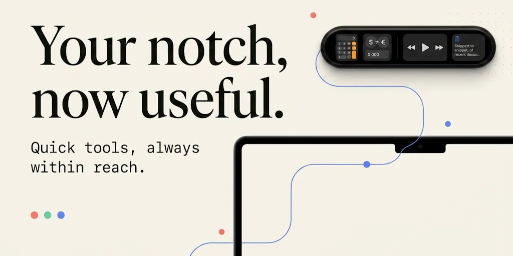
Let me be clear about what this tool is, because the Product Hunt page is light on specifics and heavy on vision. Fide Island is a macOS utility that turns the notch area into an interactive space for quick actions — calculator, currency conversion, media controls, calendar events, files, clipboard history, and system feedback. The maker describes it as “a small utility space that’s always within reach” for tasks that shouldn’t require opening a separate app. In his own words, he wanted to avoid “opening Calculator, switching to the browser, searching for a currency converter, or jumping between apps for something that should take a few seconds.”
That’s the pitch. But here’s what actually matters for someone who runs social accounts: the problem Fide Island solves isn’t “the notch is ugly.” The problem is context switching. Every time you leave your editing timeline to check a number, convert a payment from a client in another currency, or glance at your clipboard for that link you copied ten minutes ago, you’re paying a cognitive tax. You lose your flow. You forget what you were doing. And in a world where the algorithm rewards consistency and speed, that tax adds up.
I’ve tested enough productivity tools to be skeptical of anything that promises to “save you hours a week.” Most of them save you minutes, and only if you remember to use them. But the category Fide Island is aiming at — glanceable utilities that live in your peripheral vision — has real merit. When I’m scheduling 30 posts across 5 platforms in a single afternoon, the difference between a tool that requires me to switch windows and one that lives in my menu bar or notch is the difference between finishing in two hours and finishing in three. That’s not hype. That’s just how attention works.
The maker also mentions that the app is “still evolving” and asks users what they’d want to see in the notch. That’s a smart community-building move, and it’s one that creators should steal. Instead of launching a finished product and hoping people care, he’s launching a thesis and inviting people to shape it. One commenter, Lisa, asked about a progress bar for file transfers — a use case that would be genuinely useful for creators who render long videos. The maker’s response was honest: “Right now it doesn’t track progress from arbitrary third-party file transfers, but a glanceable progress indicator for long-running tasks is exactly the kind of thing that makes sense for this space.” That’s the right way to handle a feature request: acknowledge it, validate it, and put it on the roadmap without overpromising.
Why the “Crowded Lane” Criticism Misses the Point
One commenter, Gal Dayan, made a sharp observation: “Notch utilities feel like a crowded lane right now, I counted at least 3-4 similar apps on this same page.” That’s a fair criticism, and it’s one that applies to every creator who’s ever tried to break into a saturated niche. But the maker’s response is worth studying: “I think what makes Fide Island different is less about one specific feature and more about the overall experience: a polished UI, a very accessible price, and small but genuinely useful features you can use every day.”
That’s not a differentiator. That’s table stakes. But here’s the thing — most products in a crowded lane fail because they try to out-feature the competition. Fide Island is betting on polish and price, which is a legitimate strategy. For creators, the lesson is obvious: when you’re entering a saturated space, you don’t win by adding more features. You win by being the option that feels good to use every day. That’s why some creators succeed on TikTok while others with identical content fail. It’s not the content. It’s the consistency and the polish.
How Fide Island Compares to the Tools You’re Already Using
Let’s talk about the incumbents. If you’re a social media manager, you’re probably already using a stack that includes something like Buffer for scheduling, Canva for design, and CapCut for video editing. Those are all full-featured tools that require you to be in them to use them. Fide Island is the opposite: it’s designed to be out of the way until you need it. That’s not a competitor to Buffer or Canva. It’s a complement — a utility layer that sits above your main tools and handles the micro-tasks that would otherwise interrupt your flow.
The closest comparison I can make is to the menu bar apps that have been around for years — things like Bartender for managing menu bar icons or Raycast for quick actions. Those tools work because they reduce friction. Fide Island is trying to do the same thing for the notch, which is a space that most macOS users have either ignored or actively disliked. That’s a bold bet, because the notch is physically small and visually prominent. If the UI isn’t polished, it’ll feel like a gimmick. If it is polished, it could become one of those “how did I live without this” utilities.
But there’s a deeper comparison worth making, and it’s to the way Apple itself approached Dynamic Island on iPhone. When Apple introduced it, they didn’t just shrink the notch and call it a day. They built an entire interaction model around it — notifications, live activities, media controls, timers. The maker of Fide Island explicitly says he was inspired by this: “When Apple introduced Dynamic Island on iPhone, I loved the idea of turning a hardware limitation into something useful and interactive.” That’s the right instinct. But it’s also a high bar. Apple has a team of hundreds working on that interaction model. Fide Island is one person.
Where the Math Breaks: The Limits of a One-Person Utility
Here’s where I have to be honest about the limitations. The Product Hunt page includes a comment from Soumyadip Banerjee who couldn’t install the app because macOS “flagged it for malicious files.” The maker’s response was transparent: “There are no malicious files in the app. macOS shows this warning because the app is currently not signed and notarized by Apple — I don’t have an Apple Developer account yet.”
That’s a trust issue, and it’s a big one for a utility that sits in your menu bar and has access to your clipboard, files, and system feedback. I’ve been burned by unsigned apps before, and I’m not alone. The maker says he’s “planning to get the app properly signed/notarized so this warning won’t appear in the future,” but until that happens, this is a tool for early adopters who are comfortable with manual overrides. For a social media manager who’s juggling client accounts and sensitive data, that’s a hard pass until it’s resolved.
The other limitation is scope. The maker is honest that the app doesn’t yet track progress from arbitrary third-party file transfers — which is the feature I’d actually want most as a creator who renders long videos. And the roadmap is vague: “several new features” with no specifics. That’s fine for a launch, but it means you’re betting on a vision, not on a finished product. If you’re the kind of person who likes to wait for version 2.0, this isn’t for you yet.
What Creators and Social Media Teams Can Actually Borrow From Fide Island
Let me step back from the product itself and talk about the operational lessons, because that’s where the real value is for anyone reading this.
First, the “dead space” mindset. Every creator has dead space in their workflow — the gaps between tasks where you’re not creating, not scheduling, not analyzing. That’s where the context switching happens. Fide Island is a reminder that those gaps are opportunities, not obstacles. If you’re constantly opening a browser tab to check a currency conversion or calculate a ratio for a video dimension, that’s dead space you can reclaim. You don’t need a notch utility to do that. You need to audit your own workflow and find the micro-tasks that are eating your attention.
Second, the “small but genuinely useful” philosophy. The maker’s pitch is that Fide Island isn’t about one killer feature; it’s about a collection of small utilities that you use every day. That’s a content strategy too. Instead of chasing viral moments, build a collection of small, reliable posts that your audience can count on. A daily tip. A weekly roundup. A monthly behind-the-scenes. None of those will go viral, but together they build a habit. And habits are what drive consistent engagement.
Third, the community-building approach. The maker is using the Product Hunt launch not just to promote the product, but to ask questions: “What’s one small thing you constantly open another app or browser tab for — that you’d rather have instantly available in the notch?” That’s a brilliant way to gather product feedback, but it’s also a creator move. When you launch something, don’t just broadcast. Ask your audience what they’d want next. The response from Lisa — “a glanceable progress bar up there would earn its spot” — is exactly the kind of insight you can’t get from a survey. You get it from a conversation.
Why TikTok Creators Should Care More Than LinkedIn Ones
Here’s a nuance that most coverage of this launch will miss: the value of a tool like Fide Island depends entirely on your workflow. If you’re a LinkedIn creator who writes long-form posts in a browser, you’re probably fine with your current setup. The context switching is minimal. But if you’re a TikTok or Instagram creator who’s constantly juggling video editing, audio mixing, and caption writing across multiple apps, the ability to glance at a calculator or a clipboard without leaving your editing timeline is genuinely useful. The more tools you’re using, the more you need a utility layer that sits above them.
That’s why I’d bet on tools like this gaining traction among short-form video creators specifically. The workflow is chaotic by nature — you’re in CapCut, then you’re in Canva, then you’re in your analytics dashboard, then you’re back in CapCut. Every switch is a chance to lose your place. A glanceable utility that handles the micro-tasks — checking a currency conversion for a client invoice, calculating the aspect ratio for a 9:16 video, grabbing a link from your clipboard history — is worth more than a hundred productivity apps that require you to open them.
Where My Judgment Says Fide Island Falls Short
Let me be direct: I don’t think Fide Island is ready for prime time, and I wouldn’t recommend it to a client today. The unsigned app issue is a dealbreaker for anyone who values security, and the feature set is too thin to justify the risk. The maker’s honesty is commendable — he’s upfront about the limitations and the roadmap — but honesty doesn’t make an unsigned app safe to install on a machine that holds client data.
There’s also a bigger question that the Product Hunt page doesn’t address: does the MacBook notch need to be interactive at all? Apple’s Dynamic Island works on iPhone because you hold the phone in your hand and your thumb naturally rests near the top. On a MacBook, the notch is at the top of a screen that you’re looking at, not touching. The interaction model is fundamentally different. You’re not going to reach up and tap the notch. You’re going to use keyboard shortcuts or a trackpad gesture. That means Fide Island has to be designed for glanceability, not interactivity — and that’s a harder problem than it sounds.
The maker’s response to the “crowded lane” criticism suggests he’s aware of this: “I think what makes Fide Island different is less about one specific feature and more about the overall experience.” But “experience” is hard to deliver when you’re competing with apps that have been in the space longer and have more resources. The bar for polish is high, and it’s not clear that a one-person team can clear it.
Finally, there’s the monetization question. The maker mentions “a very accessible price,” but the Product Hunt page doesn’t disclose what that price is. I’m not going to invent a number. What I will say is that utilities like this have a hard time sustaining a business model. Users expect them to be cheap or free, and they’re easy to abandon when something better comes along. That’s not a criticism of Fide Island specifically — it’s a structural problem with the category.
What I’d Watch / Test Next
If you’re intrigued by the idea of reclaiming your own dead space, here’s what I’d do this week, without downloading an unsigned app:
Audit your context switching. For one day, track every time you leave your primary tool to do something else — check a number, convert a currency, grab a link, calculate a ratio. You’ll be surprised how often it happens. That’s your dead space.
Test a menu bar utility instead. If you’re on macOS, try something like Raycast or Bartender to handle quick actions without switching apps. They’re signed, they’re stable, and they’ll give you a sense of whether the “glanceable utility” model actually works for your workflow.
Watch Fide Island’s roadmap. The maker has said he’s planning to get the app signed and notarized, and he’s got “several new features” in the pipeline. If he delivers on the file-transfer progress bar that Lisa requested, this becomes a much more compelling tool for video creators. I’d check back in a month.
Steal the community-building move. Whatever you’re launching next — a newsletter, a course, a product — ask your audience the same question Sergey asked: “What’s one small thing you constantly open another app or browser tab for?” That question will give you more product insight than any survey you’ll ever run.
The notch isn’t dead space anymore. The question is whether you’re treating your own workflow like a constraint or an opportunity.