The Creator Stack Is Drowning in Subscriptions. This Tiny Mac Utility Is a Reminder That Focus Is a Product Feature
Every social media operator I know runs the same broken workflow: scheduler tab open, analytics tab open, a drive folder of raw clips, CapCut exporting in the background, and a Slack thread asking why Tuesday’s Reel underperformed. The tooling layer that was supposed to make publishing easier has quietly become the thing eating the day. So when a maker launches something as unglamorous as a window switcher and explicitly prices it as a one-time $5.99 instead of yet another subscription, I pay attention — not because a Mac utility will fix your content calendar, but because the pricing and positioning argument underneath it is the same one creators are having with every SaaS vendor in their stack right now. fswitcher, built by Fernando Cervantes, is a small product with a disproportionately useful lesson for anyone whose job is shipping content across eight platforms without losing their train of thought.
What fswitcher Actually Fixes (and Why It’s a Creator Problem in Disguise)
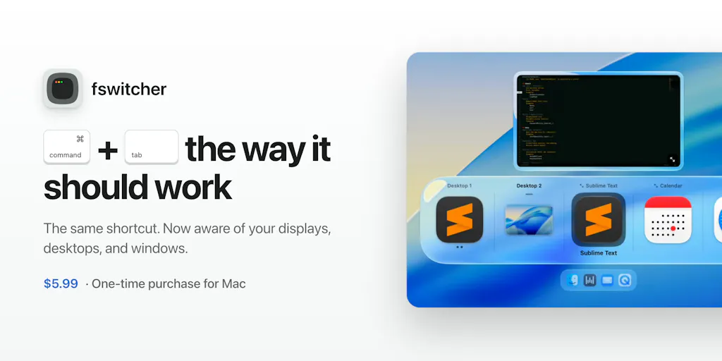
The pitch is narrow and specific: the native macOS cmd+tab switcher misbehaves on multi-display setups. Cervantes, who says he’s been building iOS apps for 16 years, lists the complaints plainly — the switcher opens on the wrong display, switching to an app sometimes lands you on the wrong screen or window, some apps don’t open at all when selected, the switcher gets cluttered with too many apps, and there’s no way to control which display it appears on. His stated design goal was to stay close to the native interaction while fixing those failures, and to charge a one-time $5.99 rather than a subscription.
If you don’t work on multiple monitors, that reads like a niche gripe. If you do — and most full-time social operators do, because you cannot review a TikTok draft, a LinkedIn carousel, and a Pinterest board layout on one 14-inch screen — it’s a daily friction tax. In my own experience running publishing workflows, the cost isn’t the two seconds of confusion. It’s the context switch: you cmd+tab to your scheduler, land on the wrong window of the wrong app on the wrong display, and by the time you’ve re-oriented you’ve lost the caption you were mid-edit on. Do that forty times a day and it’s a real chunk of your creative attention, which is the scarcest resource you have.
The maker’s answers in the thread are worth noting because they show the product is being scoped around actual multi-display behavior, not just cosmetic polish. When asked whether it remembers which display each app was last on, Cervantes confirms the switcher appears on the active display and can be moved with the fn key while open. When asked about full-screen apps and Spaces sliding around between monitors, he says it handles multiple apps, windows, and full-screened instances across desktops and displays, and that switching is scoped per display so the other monitor doesn’t move. Those are the exact behaviors that make or break a switcher for someone juggling a preview window on one screen and a scheduling queue on the other.
Why this matters more to video-first creators than to text-first ones
Here’s the pattern I’d flag: the more visual and multi-window your workflow, the more this class of tool earns its price. A LinkedIn ghostwriter can live in one browser tab. A short-form video operator cannot — they’re bouncing between a CapCut timeline, a Canva thumbnail, a Metricool or Buffer queue, and the platform’s native uploader, often with a reference video playing on a second screen. Every one of those is a separate window, and every mis-switch is a lost frame of attention. I’d bet the overlap between “runs a multi-monitor desk” and “publishes short-form video daily” is close to a circle.
The Real Story Is the Pricing Model, Not the Feature List
Strip away the macOS specifics and fswitcher is a case study in a positioning argument that creators should be stealing for their own products and applying as a filter to their own tool purchases. Cervantes is explicit about the reasoning: subscriptions are everywhere, and he figured if you make a great product, people won’t mind a one-time fee. Multiple commenters independently called out the no-subscription pricing as a plus — one noted it alongside the native-feel focus, another framed it as part of why the product is easy to trust.
That trust framing is the part I keep coming back to. The creator SaaS stack has become a subscription tax stack: a scheduler, a link-in-bio tool, an analytics dashboard, a repurposing tool, an AI caption writer, a thumbnail designer, a stock library. Individually each is $9–$99 a month; collectively they’re a mortgage payment, and the renewal emails arrive like clockwork whether or not you used the tool that month. When a maker prices at $5.99 once, they’re making an implicit promise that the product has to be good enough to stand on its own rather than good enough to justify a recurring charge. For creators evaluating tools, that’s a useful heuristic: a one-time price is a credibility signal, because the maker only gets paid if the thing actually works.
Where the math breaks
I want to be careful here, because “one-time purchase is always better” is a lazy take. A one-time price only works if the product’s ongoing costs are near zero and the update cadence is honest. A Mac utility that hooks into system behavior has to keep pace with every macOS release — and Apple ships a new major version yearly, sometimes breaking exactly this kind of low-level window management. Cervantes doesn’t disclose his update or support commitments in the thread, and that’s the open question I’d want answered before buying: does $5.99 buy me fixes through macOS 27, or through next Tuesday? For a scheduler or analytics tool with server costs and API maintenance, one-time pricing is genuinely unsustainable — which is why Later, Hootsuite, and friends charge monthly and probably always will. The lesson isn’t “demand one-time pricing everywhere.” It’s “know which category a tool is in, and price your tolerance accordingly.”
What Creators and Social Teams Can Borrow From This Launch
Three transferable ideas, in descending order of how much I think they matter.
First, the “fix the native thing, don’t replace it” design philosophy. Cervantes says repeatedly that he wanted to stay as close as possible to what people are already used to rather than build a new interaction model users would have to learn. That is exactly the right instinct for creator tools, and exactly the opposite of what most of them do. Every scheduler wants you to learn its composer. Every analytics tool wants you to learn its dashboard taxonomy. The ones that win long-term are the ones that feel like a slightly better version of the thing you were already doing. When you’re evaluating a repurposing tool or an AI caption assistant, ask: does this reduce the number of new mental models I have to hold, or add one? If it adds one, the switching cost is real and you should discount the demo accordingly.
Second, the discipline of a narrow problem statement. The maker lists five specific complaints and fixes those five. He doesn’t claim to reinvent window management, add AI, or bundle a note-taking app. In a creator-tool market where every launch page promises an “all-in-one content OS,” a product that does one annoying thing well is refreshing — and it’s a useful reminder for your own content strategy. The creators who break through on TikTok or YouTube are rarely the ones with the broadest content mix; they’re the ones who picked one format, one angle, and one audience and went deep. Narrow positioning compounds. Broad positioning dilutes.
Third, the value of reading the comment thread as product research. The most interesting thing in the entire launch isn’t the pitch — it’s the Q&A. Users surfaced the exact edge cases (Spaces, full-screen apps, display memory) that determine whether a utility survives daily use, and the maker answered each concretely. That’s the same muscle a social media manager needs when reading replies on a launch post, a viral Reel, or a support thread: the complaints in the comments are your roadmap, and the specificity of the maker’s answers is the tell for whether the product is real or vapor. When I evaluate a new scheduling tool, I go straight to the negative reviews and the founder’s replies. If the founder engages with the specific failure modes, that’s a green flag. If the replies are all “DM us!” that’s a red one.
A sidebar on AI tooling and the “one-time” question
The AI content tooling wave has made the subscription debate sharper, not softer. Most AI features — caption generation, clip selection, thumbnail variants — carry real per-use inference costs, which is why almost every AI-native creator tool is metered or monthly. Cervantes’ one-time model works precisely because fswitcher does no inference; it’s local window logic. So when you see an AI tool advertising a lifetime deal, my take is to read the fine print on usage caps before celebrating. The pricing model has to match the cost structure, and creators get burned when they assume “lifetime” means “unlimited.”
Where My Judgment Says This Falls Short
I haven’t run fswitcher myself, so everything above is inference from the launch thread and the maker’s own claims — treat the feature descriptions as his assertions, not verified benchmarks. The thread itself is thin: a handful of commenters, no disclosed user counts, no pricing beyond the $5.99 figure, no information on update policy, refunds, or how it behaves on older macOS versions. That’s not a knock on the product; it’s the normal information asymmetry of a day-one Product Hunt launch, and I’d rather flag it than pretend a comment thread is a review.
The bigger limitation is category fit. If you work on a single laptop screen and switch between four apps, the native switcher is probably fine and this is a solution to a problem you don’t have. If you’re on Windows or Linux, it’s irrelevant entirely. And if your actual bottleneck is content strategy — what to post, when, and why — no window switcher will touch it. There’s a temptation in creator circles to buy small productivity tools as a substitute for doing the harder strategic work, and I say that as someone with a genuinely embarrassing number of menu-bar utilities installed.
One more honest caveat: the “one-time purchase” praise in the thread is real but it’s also easy to over-index on. Commenters on Product Hunt are a self-selected audience of tool enthusiasts who are primed to reward indie pricing. That doesn’t mean the broader market of social media managers — many of whom expense their tools to an employer and don’t see the bill personally — will care as much. For a freelancer or indie founder paying out of pocket, $5.99 once is a no-brainer. For an agency social lead whose stack is on a company card, the pricing model is a footnote and the multi-display behavior is the whole story.
What I’d Watch / Test Next
This week, two concrete things. First, if you work across multiple monitors, audit your actual context-switching friction for one day — literally count the times you land on the wrong window while moving between your scheduler, your editor, and a platform’s native uploader. If the number is higher than you’d like, a tool like fswitcher is a cheap experiment, and the launch page is where I’d start; just go in knowing the update policy is undisclosed and the user base is unproven. Second, and more importantly for the operators reading this: apply the same lens to your paid tool stack. List every subscription, note which ones you used last month, and ask of each whether it’s a “one-time-feeling” utility you’re renting or a genuinely ongoing service. Cancel the ones in the first bucket that you barely touched. The discipline of paying once for tools that earn it — and paying monthly only for tools that actually need to run servers — is a small operational edge that compounds, the same way narrow content positioning does.
The unglamorous truth is that most creator productivity gains don’t come from a new AI feature. They come from removing a small, repeated annoyance and getting your attention back. fswitcher is one of those, for one specific kind of desk. The question worth asking about your own stack is how many of those annoyances you’ve quietly learned to live with.