The feedback loop is still the weakest link in a creator’s workflow — and that’s a bigger social media problem than it sounds
If you run social accounts for a living, you already know the dirty secret of the job: the publishing part is the easy part. The hard part is the loop that happens before anything goes live — the carousel that goes through four rounds of “can we move the logo up?” in a WhatsApp thread, the Reel cover that gets approved in a screenshot but looks wrong on the actual grid, the landing page you’re driving paid traffic to that has a broken CTA on mobile and nobody noticed until the comments section did. layernote, a new feedback tool from maker Dino, is trying to collapse that loop into something closer to a single pass. It’s not a social media scheduler. But the problem it’s solving — pinning feedback to the exact element, closing the loop with what changed — is the same problem every content team I’ve worked with is quietly losing hours to every week.
What layernote actually does, in operator terms
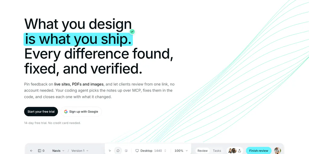
The pitch from the maker is deliberately unglamorous: you build something, people pin comments on the exact element rather than on a screenshot, you fix it, and the note closes with a record of what changed. That’s the whole loop. The team describes it as “one loop” with four steps, and the practical details are what matter here: it works on live sites, PDFs, and images; clients comment through a share link without needing an account; and on the Studio and Team tiers, every comment becomes a task on a board.
The part that should make a social media operator’s ears perk up is the agent integration. The maker says your agent gets “the element, the note and the CSS behind it, so it does not have to guess,” and that you can pull comments into Claude Code or Cursor over MCP. That’s a meaningful shift in how design feedback becomes executable work. Instead of a Slack message that says “the button looks off,” you get a structured object: this element, this note, this CSS, this task. If you’ve ever tried to hand a vague client note to a developer or an AI coding assistant, you know exactly why that distinction matters.
The honest caveat from the maker is worth repeating because it’s the kind of transparency you rarely see in a launch post: the Figma integration is not open yet. Figma is still reviewing the app, so importing frames and the Figma-versus-live comparison are “coming soon.” The comparison feature — which measures spacing, type, and color and lets you pick which differences become comments — is built, but gated behind that review. There’s a 14-day free trial with no credit card required. Pricing beyond the existence of Studio and Team tiers is not disclosed in the source.
Why this is a social media story, not just a design story
Here’s my take, and it’s the reason I’m writing about this at all: the creator economy has spent the last three years optimizing the output side of content — scheduling, repurposing, cross-posting, analytics — while the input side remains a mess of screenshots, voice notes, and “can you send me the file again?” threads. Tools like Buffer, Later, and Metricool have made publishing genuinely smooth. Canva and CapCut have made asset creation accessible to anyone. But the review and approval layer — the part where a client, a brand partner, or a legal reviewer actually signs off — is still largely happening in email and DMs.
That’s a gap with real operational cost. When I scheduled a batch of posts across five platforms for a client last quarter, the bottleneck wasn’t the scheduling tool. It was the two days of back-and-forth about whether the headline on the carousel matched the approved copy deck, and the fact that the “approved” version lived in a screenshot that nobody could annotate precisely. A tool that pins feedback to the live element and closes the loop with a change record would have cut that cycle in half. That’s not a hypothetical — it’s the exact workflow layernote is describing, and it’s the workflow most social teams are still running on duct tape.
How it stacks up against the tools you’re probably already paying for
The obvious comparison is Figma itself. Figma’s comment system is excellent for design files, and its dev mode has gotten genuinely useful for handing off specs. But Figma’s comments live in Figma. The moment your asset leaves the design file — a live landing page, a PDF media kit, a static image you’re about to post — you’re back to screenshots. The maker’s own framing acknowledges this: the Figma-versus-live comparison is the piece he cares about most, precisely because the gap between the design and the shipped thing is where most errors hide.
The second comparison is Markup.io and similar website annotation tools. These have existed for years and do the core “pin a comment to a live page” job reasonably well. Where layernote appears to differentiate is the agent handoff and the task-board integration. Markup.io is a feedback layer; layernote is trying to be a feedback-to-execution layer. That’s a meaningful distinction for teams that have adopted AI coding assistants, and a less meaningful one for teams that haven’t.
The third comparison — and the one I’d push a social media operator to think hardest about — is the project management stack you’re already running. If your team lives in Asana, Trello, or Linear, the question isn’t whether layernote’s board is better. It’s whether you want a second board. The maker’s claim that “every comment is also a task on a board” is only a feature if that board is where your team actually works. Otherwise it’s another tab.
Why TikTok creators should care more than LinkedIn ones
This is a nuance I’d flag for anyone evaluating whether this tool is for them. The creators who will get the most out of layernote are the ones shipping visual, reviewable assets on a tight cadence: TikTok and Reels creators working with brand partners who need to approve hooks and on-screen text, YouTube creators whose thumbnails and end screens go through sponsor review, Pinterest and Instagram operators managing client grids where every tile is a mini design review. If your content is a text post on X or a thought-leadership update on LinkedIn, the review surface is thin and a tool like this is probably overkill. The more visual and the more stakeholder-heavy your workflow, the more the pin-to-element model pays off.
What creators and social teams can borrow from this, even without buying it
The most valuable thing about layernote isn’t the product — it’s the workflow discipline it encodes. Here’s what I’d steal regardless of whether you ever sign up.
Pin feedback to the artifact, not to a description of the artifact. The single biggest source of revision cycles in content production is ambiguous feedback. “Make the CTA pop more” means five different things to five different people. “This element, this note, this CSS” means one thing. You don’t need layernote to adopt this principle — you need a shared canvas where comments attach to the actual asset, not to a screenshot of it. Figma does this for design files. Frame.io does it for video. For everything else, you’re improvising, and the improvisation is where the hours go.
Close the loop with a change record, not a status update. The maker’s fourth step — “the note closes with what changed, so you can see it on the page instead of reading a status” — is the part most teams skip. A status update says “done.” A change record says “this element, this property, this value, now.” The difference matters most when you’re working with clients who need to trust that their feedback was actually addressed, and when you’re working with AI agents that need structured input to be useful. If you’re already using AI in your content workflow — and if you’re not, you’re in a shrinking minority — the quality of your input structure is the ceiling on your output quality.
Treat the review layer as part of your content ops, not an afterthought. Most social media managers I know have a documented publishing workflow: draft, design, schedule, publish, analyze. Very few have a documented review workflow. That’s backwards. The review layer is where timelines slip, where brand partnerships go sideways, and where the gap between what was approved and what shipped causes actual problems. Whether you solve it with layernote, with a disciplined Figma comment culture, or with a shared Notion database with element-level comments, the point is to solve it deliberately.
Where the math breaks
I want to be honest about the limits of this framing. A tool like layernote doesn’t fix a broken approval process — it exposes it. If your client is the kind of stakeholder who gives feedback in three different channels and never consolidates, a pinning tool won’t change that behavior; it’ll just give you a cleaner record of the chaos. If your team doesn’t have a single source of truth for what “approved” means, adding another board doesn’t create one. And if your content volume is low enough that you can hold the whole review cycle in your head, the overhead of adopting a new tool may exceed the benefit. My take: this category pays off above a certain volume and stakeholder count, and below that threshold, you’re better off with a disciplined screenshot-and-comment workflow in whatever tool you already have open.
Where my judgment says it falls short
The Figma gap is the biggest open question. The maker is transparent that the integration is pending review, and that the comparison feature — the one he says he cares about most — is built but not live. That means the core value proposition for design-heavy teams is, for now, a promise. If you’re evaluating this today, you’re evaluating the live-site, PDF, and image workflows, not the Figma-versus-live comparison. That’s a real limitation, and it’s the kind of thing that should factor into a trial decision. The 14-day window may or may not overlap with the Figma approval; that timing is not disclosed.
The second gap is pricing transparency. The source confirms a 14-day free trial with no credit card and the existence of Studio and Team tiers, but no dollar figures. For a tool that’s competing with free tiers from Markup.io and the comment systems already bundled into Figma and Notion, pricing is a material unknown. I’d want that answered before committing a team to a new workflow.
The third gap is the one I’d flag hardest for social media operators specifically: this is not a social media tool. It doesn’t schedule, it doesn’t publish, it doesn’t pull platform analytics, and it doesn’t understand the difference between a Reel and a carousel. If you’re looking for something that lives inside your existing social stack, this isn’t it. It’s a layer that sits upstream of your social stack, in the review phase. That’s a legitimate place to add value — but it means adoption requires an extra step in your workflow, and extra steps are exactly what busy social teams resist.
Who this is not for
If you’re a solo creator who ships content without external review, layernote is probably not for you. If your “client feedback” process is a single trusted collaborator who tells you what they think over a call, you don’t need element-level pinning. If your content is primarily text-first and platform-native — threads, LinkedIn posts, newsletter cross-posts — the review surface is too thin to justify the tool. And if you’re already deep in a Figma-centric workflow where design and review happen in the same file, the marginal gain is smaller than the pitch suggests. The tool’s sweet spot is teams with multiple stakeholders, visual assets, and a real cost to revision cycles — agencies, in-house brand teams, and creators with sponsor or client review requirements.
What I’d watch / test next
If you’re curious, here’s what I’d actually do this week, in order. First, run the 14-day trial on a single live project — not a hypothetical, an actual client or brand deliverable you’re currently reviewing. The point is to test whether pinning feedback to the live element changes the quality of the feedback you get, not just the speed. Second, test the agent handoff specifically: pull a note into Claude Code or Cursor over MCP and see whether the element-plus-CSS context actually reduces the back-and-forth. That’s the claim I’d stress-test hardest, because it’s the one that’s genuinely differentiated. Third, ask the maker directly about Figma timing and pricing — both are unknowns in the source, and both affect whether this is a trial-and-abandon or a real workflow change. And fourth, before you adopt anything, write down your current review workflow as it actually happens, not as you wish it happened. The gap between those two documents is the real measure of whether a tool like layernote is solving your problem or just adding a nicer surface to a process you haven’t fixed yet.