The creator tooling gap nobody talks about: we’ve automated the publishing layer but not the “point at the thing” layer
Here’s the pattern I keep seeing in creator stacks this year: the publishing and analytics layer is basically solved. You can schedule a month of cross-platform posts in Buffer or Later, pull unified metrics into Metricool, repurpose a vertical video into five formats with CapCut and Canva, and route it all through a content calendar that actually holds up. What is not solved is the layer underneath — the landing pages, link-in-bio pages, and lead-capture microsites that all that content points at. That’s where creators still lose entire afternoons, and it’s the exact gap I want to talk about using a Product Hunt launch as the lens.
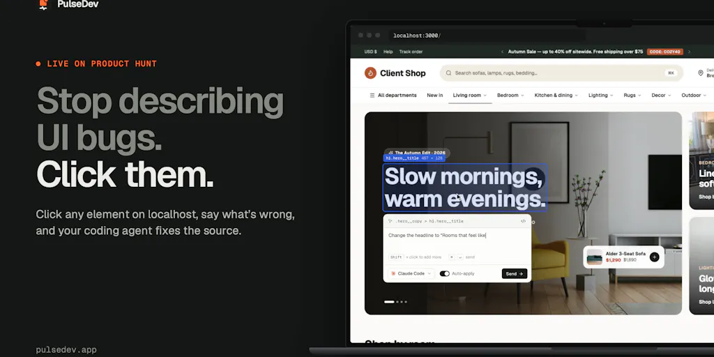
The launch is PulseDev, from maker Perlat Kociaj at Haptiker. On the surface it’s a developer tool: click an element on your local site, describe the change, hand the context to a coding agent like Claude Code or Codex, review the diff in the browser. But if you run social for a living, read that description again and substitute “developer” for “solo creator who built their own link-in-bio page in Vite because the no-code builder was too slow.” That’s the person I think about. The tooling that made publishing effortless has quietly made the page you publish to the new bottleneck, and almost nobody is building for the operator who owns both ends of that funnel.
My thesis, stated plainly: the next meaningful productivity gain for creators and social teams isn’t another scheduler or another AI caption generator — it’s closing the loop between what you see on a page and what you ask an agent to change. Every conversion page you own (bio link, lead magnet, waitlist, product drop) is a living UI that needs constant micro-edits, and the current workflow for making those edits is embarrassingly manual. PulseDev is a narrow, Mac-only, early-stage answer to that. It’s not a creator tool and doesn’t pretend to be. But the pattern it encodes — visual selection as structured context for AI — is one I’d bet creators will be stealing within a year, whether or not they ever touch this specific app.
What problem this actually solves (and why it rhymes with your job)
The maker’s framing is precise, and I want to preserve it because it’s the whole point: when you build a page with a coding agent, you can see what needs changing — a button that doesn’t line up, a heading that wraps badly, spacing that feels off — but turning that visual observation into a text prompt is a lossy, tedious translation. You open DevTools, copy a selector, take a screenshot, hunt for the component, paste it all into a terminal, and hope the agent has enough context. Then you go back to the browser to check. For a small visual change, explaining the task can take longer than the change itself. As the maker puts it, “I was already looking at the bug. I just wanted to click it.”
That is exactly the friction creators hit on conversion pages, just with different vocabulary. When I audited a client’s link-in-bio page last quarter, the list of fixes was: the CTA button was 6px shorter than the secondary one, the hero headline wrapped to three lines on mobile, the email field sat too close to the button, and the “follow” icons were misaligned by a few pixels. Four trivial changes. Each one required me to describe a visual defect in words to whoever owned the code, or to fumble through a page builder’s drag handles and break something else. Multiply that by every campaign landing page you spin up and you’ve found a real tax on creator output.
The mechanics, briefly, so you can judge the claims yourself
PulseDev works in three moves, per the launch page: you open your local site in your own browser and click an element (shift-click to grab more than one), you describe the change in plain language (“match this button’s height to the one beside it”), and you send it to a coding agent — the page names Claude Code, Codex, Gemini CLI, and OpenCode — then watch the agent’s activity beside the page. You can review the proposed diff in the browser and approve or reject it, or enable auto-apply. The context it attaches is the selected element’s selector and styles, and a Vite plugin adds source mapping “where supported” to help the agent find the relevant code. You add the widget via a script tag, or use the Vite plugin for source mapping. Your agent’s usual usage limits and provider charges still apply.
The part I find genuinely well-designed is the shift-click multi-select. A commenter on the launch, Oleksii Sekundant, nailed why: for “make this match that,” being able to point at both elements eliminates a paragraph of explanation. I’ve written that paragraph. “Make the primary CTA the same height as the secondary one but keep the corner radius” is the kind of instruction that sounds clear and is actually ambiguous. Pointing at two things is not.
How it differs from what you’re probably already using
Let me be honest about the comparison set, because this is where most launch coverage gets lazy. PulseDev is not competing with Buffer or Hootsuite — those live downstream, at the publishing and scheduling layer. It’s not competing with Canva or CapCut, which own asset creation. It’s not even really competing with Webflow or Framer, the visual site builders most creator-facing operators reach for when they need a real page. Those tools abstract code away from you; PulseDev assumes you (or an agent) are working in code and just makes the handoff from “what I see” to “what the agent changes” tighter.
The closest mental model is the browser’s own DevTools inspect mode, crossed with an AI coding agent, crossed with a diff review step. If you’ve used Cursor or Claude Code directly, you know the pain point: the agent is only as good as the context you feed it, and describing UI in prose is a terrible interface. PulseDev’s answer is to make the page itself the interface. That’s a meaningfully different bet than “better prompt templates” or “screenshot-to-code,” and I think it’s the right one.
There’s also a trust dimension that a lot of AI tooling ignores and this launch handles well. Multiple commenters zeroed in on the diff review — JC said the in-browser diff review is “the part that would make me actually use this,” because they don’t want an agent editing files from a screenshot description, and Allahshukur Mirzazada put it bluntly: “Nothing is written until you approve.” For a creator whose landing page is the thing their entire ad spend points at, that approval gate isn’t a nice-to-have. It’s the difference between experimenting and gambling.
Why TikTok and Instagram creators should care more than LinkedIn ones
Here’s my take, flagged as opinion: the operators who will feel this pattern first are the ones running high-volume, short-shelf-life campaigns. A TikTok creator pushing a new link-in-bio offer every two weeks, or an Instagram operator A/B testing a lead magnet landing page against three variants, is making exactly the kind of small, frequent visual edits PulseDev is built for. Their pages change constantly and their tolerance for a broken CTA is near zero because the traffic is paid and the window is short. A LinkedIn ghostwriter publishing one lead-gen page a quarter has the same problem in theory but feels it once, not weekly. Frequency is what makes the friction visible. If you’re shipping conversion pages at a cadence, the “explain the visual bug in words” tax compounds fast.
What creators and social teams can borrow from it, even without buying it
This is the section I’d want if I were reading someone else’s blog. The product is early and Mac-only, so most of you won’t install it this week. But the design pattern is transferable, and I’ve already started applying pieces of it in my own workflow. Three things worth stealing:
1. Treat visual selection as structured context, not a screenshot. The launch makes a quiet but important point: a screenshot plus a description is a lossy way to tell an agent what you mean. A selector plus computed styles is structured. When you brief a freelancer, a designer, or an AI on a page change, the highest-leverage thing you can hand over is the element, not a paragraph about the element. In my own tests of similar “describe the change” workflows, the briefs that included a selector or a precise element reference got fixed in one pass; the ones that said “the button looks off” got fixed in three. That’s not a PulseDev feature, it’s a lesson about how you write briefs.
2. Build the approval gate into your process before you build the automation. The diff-review step is the trust mechanism, and it maps directly onto how social teams should treat any AI-assisted publishing. If you’re using an AI tool to draft captions or generate variants, the review step isn’t bureaucracy — it’s where your brand voice and factual accuracy live. The launch commenters who said they’d never let an agent touch files without seeing diffs first are expressing the same instinct a good social lead has about auto-publishing. Automate the drafting, gate the publishing.
3. Use multi-select thinking for “match this to that” tasks. The shift-click detail is small but it reframes a whole class of requests. A huge share of page and creative feedback is comparative — “make this match that,” “use the same spacing as the section above,” “align this with the logo.” If you can point at two things instead of describing their relationship, you remove the most common source of rework. I’d bet this is the single most underrated interaction pattern in the launch.
Where my judgment says it falls short
Now the part the maker would probably prefer I soften, and the part you should read most carefully. PulseDev is early, narrow, and honest about it — which I respect — but “honest about it” doesn’t mean “ready for most creators.”
Platform lock-in is the headline limitation. The free tier is one project on macOS, and the maker confirmed in the comments that it’s Mac only for now (macOS 13 or later), with Windows “coming soon” but no date, explicitly declining to overpromise. If you’re a Windows-based social team — which is a lot of you — this is a non-starter today. The maker’s transparency here is a trust signal, but it’s still a hard wall.
The Vite source-mapping caveat matters more than it sounds. The launch says the Vite plugin adds source mapping “where supported,” and JC asked the sharpest question on the page: when there’s no source mapping, does the agent get just the selector and computed styles, or does it still try to resolve the component? That’s precisely where “make this match that” tends to fall apart, and the launch page doesn’t fully answer it. If you’re on a framework or page builder without source mapping, my expectation — flagged as inference, not fact — is that the agent gets weaker context and you’ll do more manual steering. The maker did say it works with “any framework… even WordPress themes, even page builders like Elementor,” via the script tag, but “works” and “works with rich source context” are different bars.
It doesn’t solve the page-builder problem for non-coders. If your link-in-bio page lives in Linktree or a no-code builder, PulseDev isn’t aimed at you — it assumes a local project and an installed coding agent. That’s a real segment of creators, and they should not buy this expecting it to help. The tool is for the operator who already has a code-based page and an agent in their workflow.
Pricing is simple but the value math is unproven. Pro is $12/month if you subscribe before November 3, 2026, and $18/month for new subscriptions after that, with the free tier limited to one project on macOS. For a solo creator shipping one page, that’s easy to justify if it saves a couple of hours a month. For a team, the per-seat math and the Mac requirement together make it a harder sell until Windows ships. I’d also want to see how it behaves on a real, messy production codebase rather than a clean local Vite project — the launch is clear it’s for local sites, and that’s a meaningful scope limit.
Where the math breaks
The launch’s own framing is “for the UI work that adds up” — spacing, matching styles, copy changes, polish before you ship. That’s accurate and it’s also the tell. This is a tool for many small edits, not a few big ones. If your page changes twice a year, the setup cost (install the widget or Vite plugin, wire up your agent, learn the review flow) probably exceeds the time saved. The value curve only bends in your favor once you’re making visual changes weekly. That’s a real “who is this NOT for” answer, and I’d rather say it plainly than pretend it’s universal.
What I’d watch / test next
If you run creator or social ops and want to act on this week rather than file it away, here’s what I’d actually do. First, audit your own conversion pages and count how many purely visual fixes are sitting undone — the misaligned CTA, the bad mobile wrap, the cramped form. If the number is above five, you have the problem this pattern solves, and you should care regardless of whether you install PulseDev. Second, if you’re on macOS and already use a coding agent, install the free tier on one project and test the shift-click “match this to that” flow on a real page — that’s the feature to validate, not the marketing copy. Third, if you’re on Windows, email the maker (the launch lists hello@pulsedev.app) and get on the waitlist, but don’t plan around it; the maker explicitly won’t commit to a date. Fourth, and most transferable: rewrite one page-change brief this week using an element reference instead of a description, and see if it reduces the back-and-forth. That costs nothing and tests the underlying lesson.
The bigger thing I’m watching is whether “visual selection as agent context” becomes a standard primitive across the creator stack — baked into site builders, schedulers, and AI assistants rather than living in a standalone Mac app. My bet is it does, and the operators who internalize the pattern now will be faster than the ones waiting for a polished, cross-platform version. PulseDev is an early, honest, narrowly-scoped proof of the idea. That’s a compliment and a caveat in the same sentence, which is about right for a launch this young.