The Most Overlooked Detail in Your Screen Recordings Is Now a Product Category
If you publish tutorials, software demos, or any kind of screen capture content, you already know the pain. You record a clean walkthrough of your workflow, edit out the dead air, add captions, and export. Then you watch it back and something feels off. It’s not the audio. It’s not the resolution. It’s the cursor — that default macOS arrow, tiny, white, and utterly indifferent to the care you put into everything else on screen.
For years, I treated the cursor as invisible infrastructure. It was there, it worked, but it had no personality and, more importantly, no clarity. In a fast-paced demo where I’m dragging layers in Final Cut or toggling between tabs in a Notion workspace, viewers lose the pointer. They’re watching the screen, not the arrow, and when the arrow is small and low-contrast, they miss the action entirely. This is a real engagement problem, not a vanity issue. If your audience can’t follow the cursor, they can’t follow the tutorial, and they bounce.
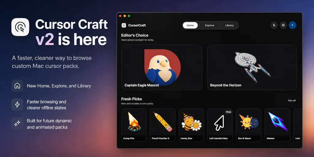
So when I saw Cursor Craft launch its v2 update on Product Hunt, I didn’t dismiss it as a novelty. I saw a tool that solves a problem I’ve actively hacked around for years — using macOS’s built-in accessibility settings to enlarge the pointer, or carefully editing in a highlight circle in post-production. The idea of a dedicated app that lets you customize, preview, and apply cursor packs natively is genuinely interesting for anyone who creates screen-based content. But the deeper story here isn’t just about aesthetics. It’s about how the tools we use to make content are becoming part of the content itself, and how a simple utility can quietly affect your production quality, your brand consistency, and even your audience’s retention.
The Real Problem: Your Cursor Is Killing Your Watch Time
Let me be specific about why this matters, because it’s not just about making your pointer look “cool.” When I schedule my weekly YouTube tutorial or a quick Loom walkthrough for a client, I’m thinking about clarity of action. Viewers on mobile — which is still the majority of traffic for most creators — are watching on a six-inch screen. A standard 24px cursor is a speck. If I’m moving quickly through a menu, the pointer blurs into the background. If I’m clicking a small button, the viewer might miss it entirely.
I’ve tested various solutions. I’ve used CleanShot X for static captures and even tried highlighting my cursor with its built-in spotlight feature. But that’s a manual toggle, and it’s easy to forget in the middle of a long recording session. The cursor is a piece of UI that you interact with for hours, yet we treat it as an afterthought. What Cursor Craft does is make the cursor a deliberate part of your setup. The v2 update, as described by the maker Birang, focuses on exactly the friction points I’ve felt: faster browsing, clearer pack pages, and better previews. That’s not just a UI polish; that’s the difference between a tool I’d use once and a tool I’d use daily.
The core insight here is that attention is the currency of the creator economy. Anything that reduces friction for your viewer — even a tiny, seemingly insignificant element like a cursor — can have an outsized impact on retention. If a viewer has to squint to see where you’re clicking, they’re not absorbing the information. They’re working to decode the visual, which is cognitive load they should be spending on your actual content.
How Cursor Craft v2 Differs From the Workarounds
There are a few ways to approach cursor customization on macOS, and I’ve tried most of them. You have the built-in accessibility options, which let you change the size and color of the pointer, but they’re clunky and limited. You have third-party apps that allow for some customization, but they often feel like system-level hacks that can break with OS updates. And then you have the “record it in post” school of thought — using tools like ScreenFlow or CapCut to add a highlight effect over your existing recording, which works but is time-consuming and can look artificial.
Cursor Craft sits in a different lane. It’s a native macOS app that focuses on the experience of the cursor itself, not just its appearance. The v2 redesign with a dedicated Home, Explore, and Library section is a signal that this is moving from a “hack” to a “platform.” The maker’s note about cached purchased packs and offline states tells me they’re thinking about reliability, which is crucial. A cursor app that fails to load when I’m about to record a client demo is a dealbreaker.
My take: this is a different beast from something like BetterTouchTool or Magnet which are about window management and system shortcuts. This is purely about the visual identity of your pointer. It’s a niche, but for a specific type of creator — the tutorial maker, the course creator, the live-streamer — it’s a high-value niche because it directly impacts the perceived quality of your output.
Why TikTok Creators Should Care More Than LinkedIn Ones
Here’s where the platform math gets interesting. If you’re posting a 30-second TikTok or Reel that’s a screen recording of you building a Notion template, the cursor is a major visual element. It’s moving, it’s drawing the eye, and if it’s ugly or hard to see, it drags down the production value. The algorithm on TikTok and Instagram rewards completion rate and watch time. If a user has to rewatch a segment because they lost the cursor, that’s a negative signal. Conversely, a clear, high-contrast cursor that’s easy to track can make your content feel more professional and easier to digest, which should theoretically boost those metrics.
LinkedIn, on the other hand, is a different beast. The audience there is often watching on desktop, in a browser, with less distraction. A standard cursor is fine. The content is usually more about the idea than the visual execution. So while a custom cursor might be a nice-to-have for a LinkedIn video, it’s a must-have for a TikTok or Reel where the visual is the entire point.
What Creators and Social Media Teams Can Borrow From This Approach
Even if you never download Cursor Craft, there are lessons here for how you operate your content pipeline.
First, the principle of micro-branding. Your cursor is a brand touchpoint. Just like your font choice, your color palette, and your intro animation, it’s a tiny detail that contributes to the overall feel of your content. The fact that a tool exists to make this customizable signals a broader trend: creators are looking to differentiate at every level, even the sub-pixel level.
Second, the focus on preview and application in v2. The maker’s emphasis on clearer previews and easier application is a direct nod to workflow efficiency. As a social media operator, I think about this constantly. The faster I can go from idea to published asset, the better. Any tool that cuts down on the time it takes to set up a recording environment — be it a custom cursor, a specific streaming software layout, or a pre-made Canva template — is a win.
Third, the idea of dynamic cursors. The maker mentions that v2 lays the groundwork for dynamic and animated cursor packs. This is where it gets genuinely futuristic. Imagine a cursor that shows a countdown timer during a live stream, or one that displays your current recording status. That’s not just aesthetic; that’s functional. It’s turning a passive UI element into an active information display. I’d bet we see more of this kind of “ambient utility” in creator tools — elements that work in the background to provide real-time data without breaking your flow.
Where the Math Breaks: The Limitations of Cursor Customization
I’m not going to pretend this is a tool for everyone. There are significant limitations and open questions.
First, the audience problem. If I’m watching your tutorial, I see your cursor. But if I’m watching on a low-resolution screen or a poorly compressed video, the custom design might look muddy or distorted. The maker’s response to a commenter about screen recording tools — noting that some tools handle the OS cursor differently — is a real concern. If your custom cursor doesn’t render correctly in QuickTime or OBS, your content looks broken, not branded.
Second, the distraction factor. One commenter on the Product Hunt page made a brilliant point: “A cursor is the one element on screen that’s meant to disappear into your hand, and motion pulls attention back onto it.” This is the core tension. An animated cursor that looks great in a preview could be exhausting in a 20-minute tutorial. The maker’s own question — “What dynamic or animated cursor ideas would you actually use?” — shows they’re aware of this. My take is that the best dynamic cursors will be the ones that are reactive (e.g., changing color when you click) rather than proactive (e.g., constantly spinning).
Third, the platform lock-in. This is a macOS app. If you’re a creator team that’s split between Mac and Windows, this doesn’t solve your cross-platform branding problem. You’d still need a separate solution for your PC-based editors. The tool is also tied to the macOS cursor rendering engine, which means its future is tied to Apple’s API decisions.
Finally, the pricing is not disclosed. The Product Hunt page shows a “Buy” button, but the price isn’t listed in the source. This is a hurdle. For a utility like this to gain mass adoption, it needs to be either free or a no-brainer impulse purchase. If it’s priced like a full-featured app like Final Cut Pro, it’s a hard sell. If it’s priced like a fancy Setapp add-on, it’s a different story.
Who This Is NOT For
If you’re a writer who occasionally does a Zoom call, skip this. If you’re a podcaster who rarely shares your screen, skip this. If you’re a marketer who only posts static graphics to Pinterest, this is irrelevant.
This is for the operator who lives in screen recordings. The course creator who spends 10 hours a week in Loom or Screen Studio. The live streamer who wants their Twitch overlay to be cohesive down to the pointer. The indie founder who records product demos for X and wants to look polished without spending hours in post-production. For that person, this tool is a targeted upgrade to their production quality.
What I’d Watch / Test Next
I’m not going to run out and buy this today, but I’m going to keep an eye on it. Here’s what I’d suggest you do if you’re intrigued.
1. Test it in your actual recording stack. Don’t just apply a cursor pack and look at it on your desktop. Open your screen recorder — whether that’s OBS, QuickTime, or CleanShot X — and record a 30-second clip. Export it at 1080p and watch it on your phone. If the cursor looks crisp and clear, it’s a winner. If it looks fuzzy or if it lags, it’s a pass.
2. Watch the “dynamic” category closely. The maker mentioned starting to release dynamic cursor packs like a “Year Progress” or “Date” cursor. These are gimmicks right now. But the concept is powerful. If they release a pack that shows a subtle recording timer or a “LIVE” indicator, that’s a game-changer for streamers. I’d bet the useful ones will be the ones that are still and subtle, not the ones that are constantly in motion.
3. Consider the brand alignment. If you do decide to use this, think about it as part of your visual identity. Does a neon green cursor fit your brand? If you’re a finance YouTuber, probably not. If you’re a gaming creator, maybe. Don’t just pick a cursor because it looks cool in the store; pick one that reinforces the feeling you want your audience to have when they watch you.
4. Wait for the reviews. The Product Hunt page shows no reviews yet. That’s a yellow flag. Let some other creators stress-test it for a week or two. See if there are complaints about battery drain (a custom cursor that’s always animating could be a power hog on a MacBook) or compatibility issues with specific apps.
The bottom line is that Cursor Craft is a niche utility that happens to sit at the intersection of two trends I care about: the professionalization of the creator toolkit and the desire for micro-personalization in digital spaces. It’s not a must-have, but it’s a sign of where the market is heading. The tools we use to create are becoming more specialized, more expressive, and more integrated into the identity of the content itself. That’s a future I’m happy to click into.