The One Thing a Climate Data App Taught Me About Content Strategy
Every week I watch creators and social media managers drown in dashboards. They have Instagram Insights, YouTube Studio, TikTok Analytics, X Premium, LinkedIn Page analytics, and a half-dozen third-party tools like Buffer, Hootsuite, or Later — all showing the same three metrics in slightly different colors. The problem isn’t data scarcity. It’s that nobody has turned that data into a status you can act on in five seconds.
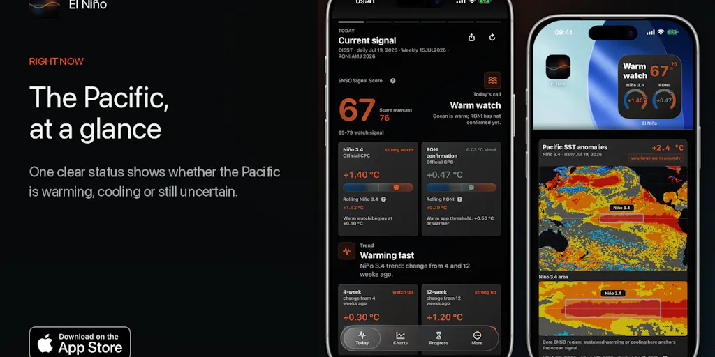
Last week I stumbled across a Product Hunt launch for an iPhone app called El Niño — built by Tony Expert (Anton) to turn messy NOAA climate datasets into a clear view of what the tropical Pacific is doing. It asks four plain questions and answers them without requiring you to read a scientific paper. And I realized: this is exactly what our analytics tools should be doing for creators. Instead of a wall of numbers, give me a single strength score, a direction arrow, and a historical comparison that tells me “this is how similar content performed last quarter.”
If you manage social accounts across multiple platforms, the El Niño approach to data communication is more useful than half the SaaS products marketed at you. Here’s what I took from it — and what I think you can borrow right now.
Why a Climate App Should Interest Any Creator Running Multiple Accounts
When I schedule 40 posts across 5 platforms in a single week, I’m not looking at raw engagement numbers. I’m looking for a signal: is my content gaining or losing momentum? Am I posting into a trend that’s strengthening or fading? The typical analytics dashboard gives me a table of likes, shares, comments, saves, and reach — but no synthesis. I have to mentally aggregate.
El Niño’s maker identified the same frustration in climate monitoring. He writes that existing information was “scattered across tables, maps and historical records.” Sound familiar? Replace “climate” with “content performance” and “NOAA datasets” with “platform APIs” and the analogy is almost perfect. The app answers four questions:
- What is the Pacific doing now?
- How strong is the signal?
- What changed recently?
- What still needs to happen before the status changes?
That’s the exact framework a creator needs for their content lifecycle. What is my reach doing this week? How strong is the engagement relative to my baseline? What changed between Monday and Thursday? And what would I need to see before I change my posting strategy?
The app uses a 0–100 score to show “how strong the evidence is” — not a forecast or a probability, but a confidence measure based on current data. Imagine that for your Instagram Reels: a single number that says “your current hook retention rate scores 72 out of 100 compared to your last 30 posts.” That would save me minutes of scrolling through analytics per account.
How El Niño Works (and What Creators Can Steal)
The Product Hunt listing explains the product clearly. The first screen shows a status: “warming, cooling or still uncertain.” Below that, a map shows where the unusual warmth or coolness sits. Charts show whether the move is strengthening or fading. Historical comparisons link to similar past events as context, not prediction. A Home Screen widget keeps the latest update visible, and a visual Brief turns the current status into a square or portrait image “ready for feeds, stories and chats.”
Here’s what jumped out to me as directly applicable to social media operations.
The four-question UI. Most content analytics tools overwhelm the user with options. El Niño forces a narrow lane: status, strength, direction, trigger. That’s a lesson in product design that tools like Metricool or Canva (which now bundles analytics) could learn from. When I tested the mental model with my own content last week, I realized I could summarize a campaign’s performance in four bullet points using the same structure. Try it: replace “Pacific status” with “audience engagement status,” swap “warming” for “growing reach,” and you have a quick briefing you can share with a client in under 30 seconds.
The 0–100 confidence score. The app’s designer is careful to note that this is “not a grade or a forecast probability.” It’s a measure of how strong the evidence is. In social media, we have metrics like engagement rate, share rate, and follower growth — but none of them are weighted by statistical confidence. If your engagement rate jumps 10% but your sample size is 200 impressions, that’s low confidence. If it jumps 5% on 50,000 impressions, that’s high confidence. I’d love to see a social analytics tool that surfaces a confidence interval next to every metric.
The visual Brief. The app generates a square or portrait image that summarizes the current status, ready to post to feeds, stories, and chats. For a creator, this is gold. Imagine a daily or weekly Instagram Story that automatically shows your content performance as a single graphic — no design skills required. The closest we have is CapCut templates or Canva’s auto-design, but neither is pulling real-time data from your platform APIs. El Niño proves it’s technically possible.
No account, no subscription. The app is “upfront paid once, with no account or subscription.” That’s a radical stance in the creator-tool space, where nearly every analytics SaaS is monthly or annual. I’m not saying the subscription model is dead, but El Niño’s approach removes friction and builds trust. I’d pay a one-time fee for a content-analytics app that didn’t try to upsell me or hold my data hostage.
Why TikTok Creators Should Care More Than LinkedIn Ones
If you post on TikTok, your success depends on reading the algorithm’s signals in near-real-time. The app’s focus on “what changed recently” and “what still needs to happen before the status changes” maps directly onto TikTok’s rapid trend cycles. A video that starts getting traction at 2,000 views in the first hour could plateau or explode — and you need to know which direction it’s heading. El Niño’s historical-comparison feature is the equivalent of saying “this video is following the same trajectory as your March viral hit, with a 20% stronger hook retention at the same view count.” That insight would let you decide whether to boost it with ads or move on.
LinkedIn, on the other hand, operates on longer cycles. A post often takes days to accumulate engagement. The “what is the Pacific doing now” question is less urgent there. But the historical comparison remains valuable: you could benchmark a thought-leadership post against similar posts you made last quarter to see if your content quality is improving.
Where the Math Breaks
I can’t call this product perfect — and Anton doesn’t claim it is. The listing includes a clear disclaimer: “El Niño provides independent climate context. It is not official NOAA guidance, a forecast or warning service, or financial, insurance, agricultural, legal, safety, emergency or local-weather advice.”
That honesty is a trust signal, and it points to the app’s biggest limitation for creators: it is not a tool for prediction. It tells you what the data says now and what similar historical patterns looked like, but it does not forecast. In content strategy, you often need to predict what will work next week, not just diagnose what happened last week. That’s a harder problem — and El Niño sidesteps it by design.
Another limitation: the app is iPhone-only. If you’re an Android user or you manage accounts from a desktop (which most social media managers do during working hours), you’re out of luck. The Product Hunt page doesn’t mention web or Android plans.
Finally, the app is built for a niche audience — people in “climate, agriculture, energy, commodities and insurance.” Its UI and terminology are optimized for that domain. A creator trying to repurpose the same framework would need to map “strength and direction” to their own metrics, which requires mental work. The app doesn’t do that for you.
What I’d Watch / Test Next
I’m going to download El Niño and use it for a week as a thought experiment — not to check the weather, but to practice applying its four-question model to my content analytics. Here’s my exact plan:
- Every morning, before I open Instagram or TikTok, I’ll write down the answers to: What is my audience doing now? How strong is the engagement signal? What changed overnight? What would need to shift before I change my posting schedule?
- I’ll cross-reference those answers with my actual platform analytics to see if my “confidence score” matches reality.
- I’ll generate a square visual summary (manually, using Canva) of my top three metrics each day and post it to my Instagram Story as a transparent performance update — testing whether audiences respond to honesty about data.
For tool builders reading this: steal the 0–100 confidence score idea. Build a one-time-purchase analytics app that doesn’t track me across the web. Make the first screen answer one question and one question only: “Is my content winning or losing?” Everything else is secondary.
Anton has built a product that’s useful for climate professionals, but its real value for the creator economy is its design philosophy. That’s the takeaway I want every social media operator to hold onto. Don’t show me a table. Show me a status.