The quiet lesson in a GitHub widget: your distribution is the product
Most creator tools die in the onboarding flow. You sign up, you connect accounts, you hit a permissions wall, and the “aha” arrives three screens too late. So when I see a launch that deliberately removes sign-up, install, and app entirely — and treats a single pasted URL as the whole acquisition funnel — I pay attention, even if the product itself lives nowhere near social media. Velocity Radar is a GitHub stats image, but its architecture is a masterclass in the thing every social media manager is actually fighting for: distribution baked into the artifact itself. If you publish across Instagram, TikTok, YouTube, X, LinkedIn, Facebook, Threads, and Pinterest, the mechanics here are worth stealing.
What Velocity Radar actually is, and the problem it’s really solving
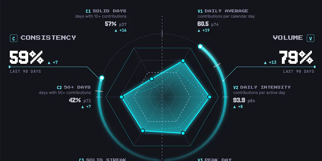
The pitch, per maker Paul Save, is that standard GitHub profiles don’t tell the whole story. Most of a serious developer’s work happens in private repositories, and as AI agents get folded into dev loops, raw commit counts get skewed by automated actions. Velocity Radar’s answer is to measure pace rather than volume: it compares your newest stretch of 30 active days against your earlier baseline, and it categorizes commits into substantive, automated, and merges — reportedly running directly inside the GitHub account so private repo names stay secure. You generate a radar and drop it on your profile.
The product is, in the maker’s own framing, “an image URL.” A developer pastes one line into a README, and every profile visit fetches a personalised PNG from velocity.id8.one. Under the hood, that’s Vercel Functions behind Vercel’s CDN, with routing rules in vercel.json giving each user clean image addresses for graphs, badges, and a 1200×630 share card. The CDN caches each image for a day and serves the stale copy while a new one renders, so a README never shows a broken image during the nightly refresh.
Here’s the part I want you to sit with. The maker says the frictionless start is the growth. No sign-up, no install, no app. That’s not a feature. That’s a distribution strategy, and it’s the same one that separates a content operation that compounds from one that plateaus.
The README is a feed, and the image is a post
Think about what a GitHub profile README actually is: a page with recurring visitors, an algorithmic-ish surface (GitHub’s own discovery, plus social sharing of profiles), and a persistent impression. It is, functionally, a pinned post on a platform you don’t control. Velocity Radar inserts a live, personalized, self-updating asset into that surface — and that asset is the ad. Every visitor who sees a friend’s radar graph is a potential new user, and the “install” is one line of markdown.
If you run social accounts, you already do a crude version of this when you add a branded lower-third, a watermark, or a UTM-tagged link in bio. Velocity Radar just makes the artifact do the acquisition work automatically. That’s the leap most creator tools never make.
How it differs from the incumbents you’re probably comparing it to
Let me be clear about category. Velocity Radar is not a social media management tool, and it is not competing with Buffer, Hootsuite, Later, or Metricool. Those tools solve scheduling, publishing, and cross-platform analytics — the operational layer. Velocity Radar solves a narrower, weirder problem: making a developer’s momentum legible and shareable inside GitHub.
But the architectural comparison is where it gets interesting, because the incumbents have spent a decade moving in the opposite direction.
- Buffer, Hootsuite, Later, Metricool all require account connection, OAuth scopes, and a dashboard. The value is real, but the friction is front-loaded. You pay in setup before you get anything.
- Canva and CapCut sit closer in spirit: they produce an asset you then distribute manually. The asset doesn’t self-update and doesn’t carry its own acquisition loop.
- Velocity Radar produces an asset that is also the distribution channel and also the onboarding. One paste, and the thing markets itself forever.
My take: the scheduling incumbents can’t easily copy this, because their core value (multi-account orchestration) requires the connection step. The lesson isn’t “remove sign-up.” It’s “find the one artifact in your workflow that could carry its own growth, and make that artifact embarrassingly easy to adopt.”
Why TikTok creators should care more than LinkedIn ones
If you’re a TikTok or Instagram creator, the analog is obvious: your best-performing format should be reproducible by your audience in under a minute. A template, a sound, a challenge structure, a caption formula. Velocity Radar’s genius is that adoption costs one line and zero decisions. Most creator “templates” cost five decisions (font, color, timing, hook, CTA), which is why they don’t spread.
If you’re a LinkedIn operator, the analog is weaker, because LinkedIn’s distribution rewards dwell time and comment velocity more than shareability of a single asset. A self-updating badge doesn’t move LinkedIn’s algorithm the way it moves a README’s utility. So the transferable lesson is format-dependent, and I’d resist the urge to bolt a “live widget” onto every channel just because it worked on GitHub.
What creators and social media teams can actually borrow
This is the section I’d screenshot if I were you. Three transferable mechanics, in order of how fast you can test them.
1. Compress onboarding to a single action
The maker’s whole thesis is that “a graph is just a cached image URL,” so there’s nothing to sign up for. In your own funnel, the equivalent question is: what is the one action a new follower or subscriber must take, and can I cut it to one? If your link-in-bio currently routes through a landing page with a form, you’ve added friction that Velocity Radar deliberately deleted. Test a direct-to-destination link, a single-tap subscribe, or a one-line CTA. Measure the delta in click-through, not vibes.
2. Make the asset carry the brand
Every radar graph, badge, and share card Velocity Radar renders is branded by default — the output is the marketing. For social teams, this is the watermark argument, but sharper: your repurposed clips, your carousel exports, your CapCut templates should all carry a consistent, recognizable signature that survives a re-upload to a different platform. When someone screenshots your TikTok and reposts it to X, the signature is your only remaining distribution.
3. Design for the cache, not just the render
This is the nerdiest and most useful lesson. The maker originally set s-maxage for the edge cache but nothing for downstream, so GitHub’s Camo proxy picked its own freshness and the graph could go stale for days. The fix — sending max-age=3600 — was a deliberate tradeoff: an hour of staleness in exchange for not hammering Camo on every README view for data that changes once a day.
Why should a social media manager care about HTTP cache headers? Because the same logic governs your content refresh cadence. If your analytics only update nightly, publishing a “live” dashboard that refreshes every ten minutes is theater. Match your refresh rate to your data’s actual mutation rate, and stop burning API quota (and platform rate limits) on updates nobody can perceive.
Where my judgment says it falls short
I want to be balanced here, because the launch has real gaps.
The audience is narrow. This is a developer-tooling product. The maker explicitly frames it for “a solo open-source builder or commanding an AI agent fleet.” If you’re a social media manager who doesn’t touch GitHub, the product is not for you — only the lessons are. Don’t confuse the two.
The “velocity” metric is a black box. The maker says it categorizes commits into substantive, automated, and merges, and compares a 30-day stretch to an earlier baseline. But the classification logic isn’t disclosed, and “substantive” is a judgment call that could be gamed or misread. I’d want to know how it handles squashed commits, rebases, and force-pushes before I’d trust the number as a signal. Not disclosed.
Caching is a moving target. The Camo issue got fixed, but it’s a reminder that this product’s entire value depends on a third party’s proxy behavior. If GitHub changes how it routes README images, the graph breaks silently. That’s a real operational risk for a “set it and forget it” asset.
No pricing, no scale numbers. The source doesn’t disclose pricing, user counts, or revenue. I won’t invent them. Treat the launch as an architecture case study, not a proven business.
Where the math breaks
The maker’s growth argument is “frictionless start is the growth.” That holds only if the asset is genuinely shareable and the platform doesn’t throttle it. On GitHub, README images are cheap and Camo caches them. On social platforms, the equivalent “live asset” often violates API terms, gets rate-limited, or renders inconsistently across the app and the web. So before you copy the pattern, check whether your target platform actually permits a self-updating, third-party-hosted asset in the surface you care about. Often it doesn’t.
What I’d watch / test next
Three concrete things you can do this week, no new tooling required.
First, audit your onboarding friction. Open your own link-in-bio on a fresh device and count the taps to your core action. If it’s more than two, cut one and measure the change in click-through over seven days.
Second, add a durable signature to your repurposed assets. Pick one visual or verbal marker and apply it to every export from Canva, CapCut, and your scheduler for a week. Then check whether your cross-platform saves and shares move — that’s the real test of whether your asset carries its own distribution.
Third, match your refresh cadence to your data. Look at how often your analytics actually update, and align any “live” content or dashboards to that rate. If you’re on Metricool or Buffer and your numbers refresh daily, stop pretending they’re real-time.
And if you are a developer-adjacent creator, generate a radar, paste the snippet, and watch whether the frictionless version actually converts profile visitors into users. That’s the experiment Velocity Radar is running on itself — and the results are the only proof that matters.