The Notch Is a Wasted Surface, and Creators Live in Their Menus
Every social media operator I know runs their business from a laptop, and every one of those laptops has a strip of dead pixels at the top of the screen. If you’re editing a Reel in CapCut, scheduling a week of posts in Buffer, and pulling analytics out of Metricool in the same afternoon, your menu bar is already the de facto command center for your workflow. So when a maker launches a tool that turns the MacBook notch into an actual control surface, it’s worth a look — not because it’s a social media product, but because it’s a small bet on where the “operator’s cockpit” is heading. iLand is that bet, and the interesting question isn’t whether it’s cute. It’s whether the notch deserves a place in your stack.
What iLand Actually Is, Stripped of Launch-Day Gloss
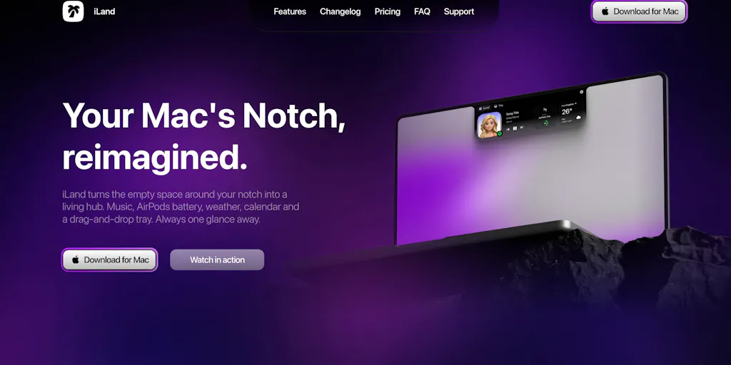
Let me start with the facts, because the launch page is thin on them. iLand is a macOS utility from maker Taha Çiftçi — who posts on X as @codemlabs — that repurposes the MacBook notch as an interactive area. According to the maker’s own launch copy, you can control playback and adjust volume with gestures, drop files into a tray, convert files, take screenshots, record your screen, check your calendar and weather, start a timer, and reach tools like a color picker, translator, and app launcher. Widgets, appearance, and animations are customizable. The stated design principle is simple: keep everyday actions close to whatever you’re already working on.
That’s the entire factual surface of the page. Pricing is not disclosed. Platform requirements beyond “Mac” are not disclosed. Whether it works on Macs without a notch is an open question — a commenter named Audrey T asked exactly that and, as of the scrape, has no answer. Another commenter, Marissa_Bronfman, framed the appeal well: the notch always felt like wasted space, and keeping small stuff close beats opening five apps.
I want to be honest about the limits of this piece. This is not a social media tool. It has no scheduling, no analytics, no publishing APIs, no content calendar beyond a read-only glance at your own calendar. If you came here for a scheduling SaaS review, this isn’t it. But the reason I’m writing about it anyway is that the category it belongs to — ambient utilities that compress repetitive micro-actions — is quietly one of the highest-leverage things a solo creator can invest attention in. And the way this launch handles customization, gestures, and widget density tells us something about how the next wave of creator-facing tools will be judged.
The real problem it solves is context-switching, not screen real estate
Here’s the operational reality. When I batch-produced a month of short-form video across five platforms last quarter, my actual bottleneck wasn’t editing or captioning. It was the tax of moving between apps: pull a clip into a converter, grab a screenshot for a thumbnail reference, check the calendar to see if I’d already booked a post for that slot, start a timer so I didn’t blow an hour on one hook. Each switch is small. Collectively they’re the difference between shipping eight posts and shipping three.
iLand’s pitch is that those micro-actions should live in the one strip of screen you’re always looking at. That’s a legitimate thesis. The file tray, the converter, the screenshot and screen-recording tools, the timer — those are exactly the friction points in a repurposing workflow. If I’m pulling a vertical crop out of a horizontal YouTube upload to repost to TikTok and Instagram Reels, a drop-tray that keeps source files handy is not a gimmick. It’s a smaller version of what Dropover does, compressed into the notch.
My take: the value here is not “the notch is now useful.” It’s “the notch is now a persistent, always-visible launcher for the six things you do forty times a day.” That’s a different and better claim.
How It Stacks Up Against the Incumbents You Already Pay For
Any creator reading this already has a menu bar full of utilities. So the honest comparison isn’t “iLand vs. nothing.” It’s iLand vs. the tools already squatting in that space.
Bartender and Ice are the classic menu bar organizers — they hide clutter rather than add function. iLand is the opposite philosophy: it adds a surface rather than tidying one. If your complaint is “too many icons,” those tools win. If your complaint is “I keep leaving my editing app to do tiny tasks,” iLand is aimed at you.
Raycast is the closest functional cousin, and it’s the comparison I’d make first. Raycast is a keyboard-first launcher with extensions, clipboard history, window management, and a deep plugin ecosystem. It’s powerful and it’s fast — but it’s modal. You summon it, you act, it disappears. iLand is ambient: it’s just there, in the notch, showing playback controls or a timer without you asking. Different ergonomics. For a creator who lives on keyboard shortcuts, Raycast probably already covers 80% of this. For someone who’d rather glance and click, the notch has an advantage Raycast can’t replicate — it’s physically where your eyes already go.
Alfred occupies similar ground to Raycast with a longer history and a loyal following. Same modal-vs-ambient tradeoff.
NotchNook is the most direct competitor, and it’s the one I’d want a head-to-head on. It also turns the notch into a functional area with a file shelf, media controls, and a calendar. If you’ve already bought into that concept, the question becomes which one handles your specific widgets better — and the launch page gives me no basis to claim iLand wins. The maker’s emphasis on customizable widgets, appearance, and animations suggests that’s where they think the differentiation lives.
One Switch and similar menu bar utilities bundle toggles like dark mode, screen saver, and screen recording into one dropdown. iLand’s screenshot and screen-recording features overlap here. For a creator who records screen demos for tutorials or course content, having that one gesture away is genuinely useful — though macOS’s built-in Screenshot toolbar already does a lot of this for free.
Why TikTok creators should care more than LinkedIn ones
This is where I’d push back on the generic “productivity tool” framing. The value of an ambient utility scales with how many repetitive, short-cycle tasks you do. A LinkedIn ghostwriter posting three times a week doesn’t need a notch tray. A TikTok or Reels creator producing daily short-form — pulling clips, converting formats, grabbing frames, timing hooks — does. Short-form volume is a volume game, and volume games are won by shaving seconds off each cycle. If iLand saves you four app-switches per video across twenty videos a month, that’s real time. I can’t quantify it from the launch page, and I won’t pretend to. But directionally, the heavier your output cadence, the more an always-visible launcher pays off.
What Creators and Social Teams Can Steal From This Launch
Even if you never install iLand, there are transferable lessons in how it’s positioned.
First: the “keep it close” principle applies to your content ops. The reason this tool resonates is that it collapses distance between intention and action. The same logic should govern your publishing stack. If your approval flow requires a creator to export a video, upload to Drive, Slack a link, wait for a manager to download it, then manually post — you’ve built the equivalent of opening five apps. Tools like Later and Hootsuite exist precisely to collapse that. If you’re still running approvals through DMs, that’s your notch problem.
Second: gestures and glanceability are underrated in dashboards. iLand’s media controls use gestures, and the calendar and weather are glanceable. Most social analytics dashboards fail this test — they’re built for deep analysis, not for the two-second check you actually do fifty times a day. If you’re building internal reporting, ask whether your key metric is visible in one glance. If it isn’t, you’ve built a tool nobody opens.
Third: customization is table stakes now. The maker explicitly calls out customizable widgets, appearance, and animations. That’s the correct read on the market. Creators have wildly different workflows, and any tool that forces one layout will get abandoned. This is why Notion templates and Canva brand kits win — they meet people where their process already is.
Where the math breaks
I’d be a bad industry observer if I didn’t flag the counterargument. Ambient utilities have a well-documented failure mode: they’re delightful for a week and then forgotten. The notch is small. It fits maybe two or three widgets before it’s cluttered. And the moment it becomes cluttered, it stops being glanceable and starts being another thing to manage. The launch copy promises a lot — playback, volume, file tray, conversion, screenshots, screen recording, calendar, weather, timer, color picker, translator, app launcher. That’s twelve functions competing for a strip of screen roughly the width of your thumb. My bet is that most users will settle on three and ignore the rest. That’s fine, but it means the “everything in the notch” pitch oversells what the form factor can hold.
There’s also the hardware question. Notchless Macs — older MacBooks, external displays, Mac minis — have no notch at all. Audrey T’s unanswered question is the one that determines whether this is a niche product for recent MacBook owners or something broader. Until the maker answers, I’d treat iLand as a tool for people with a notch, full stop.
Where My Judgment Says It Falls Short
Let me separate what I know from what I think.
What I know from the source: pricing is not disclosed. Supported macOS versions are not disclosed. Whether it works on notchless Macs is not disclosed. The maker’s background beyond the X handle is not disclosed. There’s no mention of a free tier, trial, or one-time purchase. There’s no mention of privacy posture — relevant because a translator, file converter, and screen recorder all touch your data. For a utility that sits in your menu bar all day, that’s a meaningful omission.
What I think, flagged as opinion: the feature list is too long for the surface area, and the launch would be stronger with three hero features than twelve. I’d bet the file tray, media controls, and timer are the ones that stick. I’d also bet the translator and color picker get used once and forgotten. That’s not a knock on the maker — it’s the standard pattern for utility apps that ship broad.
Who this is NOT for: If you’re on a Mac without a notch, this is probably a non-starter until the maker says otherwise. If you already run Raycast and are happy with it, the marginal gain is likely small. If your content workflow is mostly cloud-based — Canva, Descript, a scheduler — and you rarely touch local files, the file tray and converter won’t earn their keep. And if you’re a social media manager working primarily in a browser with ten tabs of Meta Business Suite and TikTok Creative Center, the notch is not your bottleneck. Your bottleneck is asset handoff and approval latency, and no menu bar utility fixes that.
The trust caveat: every capability I’ve described comes from the maker’s own launch copy. I haven’t tested iLand. I can’t verify the gestures work smoothly, that the converter handles the codecs creators actually use, or that the screen recorder doesn’t tank performance during a capture. Those are the things a hands-on review would settle, and this isn’t one.
What I’d Watch / Test Next
If you’re a creator or social operator considering this, here’s what I’d actually do this week.
First, go read the iLand launch page yourself and check whether pricing and system requirements have been added since this scrape — launch pages fill in fast, and the maker is active in the comments. Second, before installing anything, audit your own micro-actions for one working day. Write down every time you leave your main app to do something small. If that list is short, skip iLand and spend the hour fixing your approval workflow instead. If it’s long, the notch might genuinely help.
Third, if you do try it, test the three features that matter most to a content workflow — file tray, screen recording, and media controls — and ignore the rest for a week. See whether they actually reduce switches or just add a new thing to check. Fourth, if you’re on a notchless Mac, wait for the maker’s answer to Audrey T’s question before spending time on it.
And the bigger thing I’m watching: whether ambient, always-visible surfaces become a real category for creator tooling, or whether they stay a novelty. The modal launcher won the last decade. The notch is a small test of whether the next one belongs to the ambient. I don’t know the answer yet. But I’d bet the tools that win the next five years are the ones that live where your eyes already are — and for a lot of creators, that’s a strip of black at the top of the screen.