The Creator Tooling Boom Has a Curation Problem — and a Niche Keyboard App Shows What Honest Product Building Looks Like
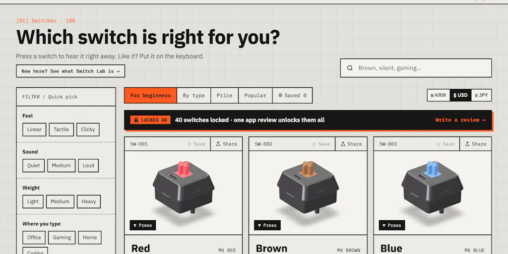
Every week I get pitched three “all-in-one” tools that promise to collapse my content calendar, my analytics, my repurposing workflow, and my monetization stack into one dashboard. Almost none of them survive contact with how I actually work: I schedule across Instagram, TikTok, YouTube Shorts, X, LinkedIn, and Threads, I keep a UTM spreadsheet open in a second tab, and I spend a stupid amount of time on the unglamorous middle — checking whether a tool’s API actually respects rate limits, whether its “best time to post” is real or vibes, and whether the maker has ever run an account with a real audience. So when I stumbled on Switch Lab, a browser-based 3D mechanical keyboard where you can swap 100 switches and type on them, my first reaction wasn’t “cute.” It was: this is a masterclass in niche product honesty, and it’s a useful mirror for the creator-tooling category I cover every day. The maker, DongSup_Ahn, shipped something free, no sign-up, in three languages, and then — in the comments — openly admitted the audio limitation instead of hiding it. That’s rarer than it should be, and it’s worth unpacking why it matters to anyone building or buying tools in the creator economy.
The problem Switch Lab actually solves (and why it’s a creator-economy parable)
Mechanical keyboard switches are a physical-feel problem dressed up as a spec-sheet problem. You can read about actuation force, pre-travel, and spring weight all day, and you can watch sound-test videos until your ears bleed, but the maker’s own framing is the honest one: “you still don’t really know how a switch feels until it’s on your keyboard.” That’s the same gap creators face with software. A scheduling tool’s landing page tells you it supports “all major platforms,” but you don’t know if its TikTok publishing respects the current API constraints or whether its Instagram carousel flow breaks on the third slide until you’ve connected an account and scheduled thirty posts. The demo is never the workflow.
What Switch Lab does is compress the “buy a sample pack and hope” loop into a browser tab. You swap switches in one click, type immediately, compare a silent linear against a clicky blue on the same board, and check prices across shops per switch. There are three typing games — Typing Marathon, Stem Drum, and Switch Metro — which are, functionally, engagement mechanics: they give you a reason to keep typing long enough to form an opinion. That’s a repurposing lesson in itself. The core utility (compare switches) is wrapped in a retention loop (games) so the session lasts long enough to be useful. I’d bet most creator tools would convert better if they stole that structure: give the operator a reason to stay in the tool for ten minutes, not ten seconds.
Why this matters more to TikTok and YouTube creators than to LinkedIn ones
Here’s the operator translation. TikTok and YouTube Shorts are feel-and-timing platforms — the algorithm rewards watch time and rewatches, and the difference between a hook that lands and one that doesn’t is often a half-second of pacing you can only judge by watching the finished cut, not by reading the script. That’s the switch-feel problem exactly: you can’t spec your way to it, you have to test it in context. LinkedIn and X are more text-and-timing platforms where the “feel” is easier to reason about from a draft. So if you’re a short-form creator evaluating, say, a CapCut alternative or a repurposing tool that claims to auto-cut long video into shorts, the Switch Lab lesson is: demand a try-before-you-commit surface. If the tool won’t let you run your own footage through the actual pipeline before you pay, treat its demo reel as marketing, not evidence.
How it differs from the incumbents — and what that says about tooling strategy
The obvious comparison set for Switch Lab is the mechanical-keyboard sample ecosystem: NovelKeys sample packs, KBDFans switch testers, and the sprawling sound-test library on YouTube. Those are physical or passive — you buy plastic, or you watch someone else’s recording. Switch Lab’s differentiator is interactivity in the browser with zero friction: no sign-up, free at switchlab.app, English, Korean, and Japanese. The closest software analog in the creator world is the “free tier as demo” model that Buffer and Later use to get you into the scheduling workflow before you hit the paywall. Switch Lab skips the paywall entirely, which is a distribution strategy as much as a product decision.
The more interesting comparison is to the AI content tooling wave. Most of those products are horizontal — they’ll write your caption, generate your thumbnail, and schedule the post, and they’re competing on breadth. Switch Lab is aggressively vertical: one problem, one surface, done well enough to be genuinely useful. In my experience testing scheduling and analytics SaaS, the vertical tools with a narrow, honest core tend to retain operators longer than the horizontal suites that do fifteen things adequately. Metricool is a decent example of a tool that earned trust by being transparent about what its analytics can and can’t see across platforms; the suites that promise omniscience are the ones I churn from fastest. The maker’s decision to keep the volume differences between switches on purpose — because loudness is part of the buying decision — is the kind of product judgment that only comes from actually caring about the user’s real decision, not the demo’s polish.
Where the math breaks
The maker is refreshingly clear about the audio problem, and it’s worth quoting the exchange because it’s a template for how to handle a limitation. When a commenter asked whether 38 different source channels with different mics and rooms make some switches sound off, the maker agreed: “The 3D board is the same, but the audio still comes from different recordings, so each clip carries its original board, keycaps, mic and room.” He normalizes loudness so no switch sounds louder just because of the recording, but concedes he “can’t remove the mic and room character,” so it’s “best for rough comparisons and not a replacement for trying the switch in person.” That’s the whole ballgame. A lesser product would have buried that in a FAQ. This one put it in the reply thread, unprompted, and offered to re-source any clip that sounds wrong.
For creators, the parallel is platform analytics. Every tool that reports “engagement rate” is making a normalization choice — do they divide by reach, by followers, by impressions? — and most don’t tell you. The ones that do, and that flag when a metric is directional rather than definitive, are the ones I trust with client reporting. If you’re evaluating an analytics tool this quarter, ask it the same question the commenter asked Switch Lab: where does your data come from, and what does that source fail to capture? If the answer is “our proprietary AI,” walk.
What creators and social media teams can borrow from this launch
Three things, and they’re all operational.
First, the free-no-signup wedge. Switch Lab’s entire funnel is “land, type, form an opinion, maybe buy a switch.” No email gate, no trial countdown. For creators, the analog is your top-of-funnel content: the free, ungated thing that lets a stranger experience your point of view before they subscribe, follow, or buy. If every piece of your content is gated behind a lead magnet, you’re optimizing for list size over trust. I’ve watched accounts grow faster on a “here’s the whole framework, free, no catch” post than on a month of teaser carousels.
Second, the engagement loop around the utility. The three typing games aren’t the product — the switch comparison is — but they’re what makes a session long enough to matter. When I scheduled 30 posts across 5 platforms last month, the tools that kept me in the workflow were the ones with a satisfying intermediate step (a clean preview, a fast bulk-edit, a drag-and-drop calendar) rather than a form to fill. If you’re building any internal content process — a repurposing pipeline, a review checklist — design the intermediate steps to be pleasant, not just correct. That’s a retention mechanic for your own team.
Third, the honest-limitations comment. The maker’s reply is a case study in trust-building under a launch post. He didn’t defend the product; he scoped it. “Best for rough comparisons and not a replacement for trying the switch in person” is a sentence that loses a sale and wins a customer. In creator terms: when you recommend a tool to your audience, scope it the same way. “This scheduler is great for Instagram and Threads, but its YouTube analytics are shallow” builds more authority than a blanket endorsement, and it protects you when the tool changes its API and breaks.
Why LinkedIn creators should care more than they think
The instinct is that a keyboard toy is a TikTok/YouTube thing. But the LinkedIn lesson is the comment thread itself. LinkedIn’s distribution rewards posts that generate substantive replies, and the maker’s exchange with a skeptical commenter is exactly the kind of back-and-forth that extends a post’s life. If you’re running a company page or a founder account, the move isn’t to post the launch and hope; it’s to seed the comment section with a real limitation and answer it well. That’s a content strategy, not a support ticket. I’d bet a well-handled “here’s what our product doesn’t do” comment does more for a B2B launch than three polished feature posts.
Where my judgment says it falls short
Let me be the skeptic, because that’s the job. Switch Lab is a passion project with a real ceiling. The audio provenance problem is structural: 38 YouTube channels means 38 boards, 38 mic chains, 38 rooms, and no amount of loudness normalization fixes the timbre mismatch. The maker says long term he’d like to record them himself on one board — until then, the comparison is directional, and anyone using it to make a final purchase decision is over-reading it. That’s a real limitation, not a nitpick, and it’s the kind of thing that caps a tool’s usefulness at “shortlist generator” rather than “decision engine.”
The business model is also unstated. It’s free, no sign-up, no disclosed monetization. The price-check feature across shops suggests affiliate links may be the eventual path, but the source doesn’t say, so I won’t assert it. For creators, the lesson is to be wary of free tools with opaque economics — not because free is bad, but because a tool with no visible revenue model has no visible incentive to maintain its data, and stale switch prices or dead links are the failure mode. I’d want to see how the shop data is refreshed before I’d rely on it.
And the scope is narrow by design. If you’re a creator looking for a scheduling or analytics tool, Switch Lab is not for you — it’s a keyboard-switch comparison app, full stop. The reason I’m writing about it in a creator-economy column is the product philosophy, not the product category. Don’t mistake the parable for a recommendation.
What I’d watch / test next
This week, I’d run three concrete tests. One: open Switch Lab and treat it as a case study in scoping — read the maker’s comment reply and ask whether your own launch or content announcement includes an equivalent honest limitation. If it doesn’t, add one. Two: audit one tool in your stack against the “where does your data come from” question — pick your analytics or scheduling platform, find its documentation on metric definitions, and note where it’s directional rather than definitive. Three: if you’re building anything, steal the free-no-signup wedge for your next top-of-funnel asset and measure whether ungated beats gated for your audience. I’d also keep an eye on whether Switch Lab adds self-recorded audio on a single board — that’s the upgrade that would move it from rough comparison to genuine reference, and it’s the kind of follow-through that separates a launch-day spike from a tool people return to.