The Notch Is the New Dashboard: What TinyKPI Signals About How Creators Will Monitor Their Numbers
If you run social accounts for a living, your analytics problem isn’t a lack of data — it’s that the data lives in seven browser tabs you never open. Instagram Insights, TikTok Analytics, YouTube Studio, LinkedIn’s anemic dashboard, a Stripe tab for revenue, a PostHog tab for funnel behavior. The numbers that should inform your next post are always one context-switch away, which is why most creators check them weekly instead of hourly. That gap is exactly what TinyKPI is poking at — a MacBook-notch dashboard built by a solo developer, Rida Ennasry, who got tired of his own metrics being scattered across Stripe, PostHog, Clerk, and raw databases. It’s not a social media tool. But the design instinct behind it — ambient, glanceable, always-on metrics — is something every social operator should be stealing.
What TinyKPI Actually Is (and Isn’t)
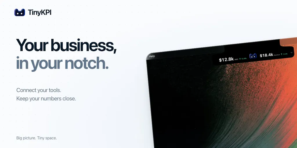
Let’s get the facts straight before I editorialize. TinyKPI is a first-release product that lives in the MacBook notch — that dead strip of screen real estate between the menu bar and the webcam. According to the maker’s own launch post, it’s “100% local, customizable,” and built because his “business metrics were scattered everywhere.” In the same thread, when a commenter asked whether it could hold multiple Google Analytics properties and switch between them, the maker confirmed that TinyKPI supports multiple projects, that you can create one per client, connect their Google Analytics property separately, and switch between them as needed.
That’s the entire disclosed feature set. Pricing: not disclosed. Platform support beyond macOS: not disclosed. Number of integrations beyond the ones named in the launch thread: not disclosed. Team size: one person. This is a v1 from a solo builder, and I want to be blunt about that because Product Hunt launches tend to get read as mature products when they’re often just a working hypothesis.
Why the notch, of all places?
Because it’s the one strip of screen you never cover with a window — a point commenter Pascal Couturier made well when he noted it’s “the one strip of screen I never cover with a window.” That’s not a trivial UX observation. It’s the entire thesis. Dashboards fail not because they lack data but because they require a deliberate act of navigation. You have to want to check them. Ambient displays flip that: the number comes to you. For a social media manager juggling five client accounts, the difference between “I’ll check engagement later” and “I noticed engagement dipped 40 minutes ago” is the difference between reactive reporting and real-time creative adjustment.
The Real Problem: Social Analytics Is a Navigation Tax
Here’s where I’ll get opinionated. The social media tooling market has spent a decade solving the wrong half of the analytics problem. Tools like Buffer, Hootsuite, Later, and Metricool have gotten genuinely good at aggregation — pulling Instagram, TikTok, X, LinkedIn, Facebook, Threads, and Pinterest metrics into one reporting surface. What they haven’t solved is frequency of attention. You still have to open the app. You still have to click into the client. You still have to wait for the dashboard to render. And for the vast majority of solo creators and small agency operators, that friction means analytics get checked during reporting windows, not during the creative process.
I’ve run accounts where the entire weekly analytics ritual was: open Metricool, screenshot the numbers, paste into a Notion doc, never look at it again. The data existed. The insight didn’t, because insight requires repeated exposure to the same number until a deviation becomes obvious. That’s a behavioral problem, not a data problem, and it’s why I think ambient displays — notch apps, menu bar widgets, Raycast extensions, even a pinned browser tab — are quietly more valuable than another dashboard with more charts.
Why TikTok creators should care more than LinkedIn ones
The value of ambient metrics scales with how fast your platform’s feedback loop runs. On TikTok, a video’s first 60–90 minutes determine whether it gets pushed to the next traffic pool — watch time, completion rate, and early engagement velocity are the signals the algorithm reads. If you’re posting three times a day and only checking analytics at 9pm, you’ve already lost the window to double down on a format that’s working or kill a hook that isn’t. Same logic applies to Instagram Reels and YouTube Shorts, where the first-hour click-through and retention curves shape distribution.
LinkedIn is the opposite. Its algorithm rewards dwell time and comment depth over a longer horizon, and a post can pick up steam 48 hours later. If you’re a LinkedIn-first operator, an always-visible metric strip is a nice-to-have. If you’re a TikTok-first operator, it’s closer to a competitive requirement — and that’s my take, not something the product claims.
What Social Teams Can Borrow From the TinyKPI Playbook
I don’t think most social media managers should install TinyKPI tomorrow. It’s a Mac-only, single-builder, v1 tool with a narrow integration list, and your actual workflow probably lives in a browser. But the design pattern is worth stealing regardless of whether you ever touch the product. Here’s what I’d extract:
1. Pick three numbers, not thirty. The maker’s stated motivation was wanting “the numbers I care about somewhere I could just glance at.” That’s the discipline. Most social dashboards drown you in reach, impressions, profile visits, follows, saves, shares, comments, watch time, average view duration, and on and on. The operators I respect pick a small set — usually one leading indicator (posting consistency or hook retention), one engagement quality metric (saves or comment-to-view ratio), and one business metric (link clicks via UTM or attributed revenue). Everything else is diagnostic, not directional.
2. Make the number impossible to avoid. Whether that’s a pinned browser tab, a menu bar widget, a Notion dashboard you actually open, or a Slack bot that posts yesterday’s numbers at 9am — the mechanism matters less than the ambient quality. If you have to remember to look, you won’t.
3. Segment by client or project from day one. The comment thread on the launch page is instructive here: the first serious question wasn’t about integrations or pricing, it was about whether the tool could hold multiple Google Analytics properties for a studio with client accounts. That’s the actual shape of agency work. If you’re building any kind of internal metrics view — even a spreadsheet — structure it per client, per platform, with a consistent set of columns, so switching context doesn’t mean re-learning the layout.
4. Keep it local where you can. The maker’s emphasis on “100% local” is worth noting because it’s increasingly rare. Most social analytics SaaS routes your data through their servers, which means API rate limits, sync delays, and a third party holding your client’s performance data. For solo operators and small studios, local-first tools reduce both privacy surface and the “why is my dashboard stale” problem. That said, local-first also means no mobile access — a real tradeoff I’ll get to.
Where the math breaks
Here’s the honest limitation of the whole ambient-metrics genre: a number you glance at is not a number you understand. Social analytics are notoriously easy to misread. A dip in reach might be a platform-wide algorithm shift, a seasonal pattern, a posting-time change, or a content-format change — and a notch widget showing “reach: down 12%” tells you none of that. Ambient displays are excellent at triggering questions (“why did saves drop?”) and terrible at answering them. If you install one and start making creative decisions off a single uncontextualized number, you’ll chase noise. The tool is a smoke detector, not a fire investigation.
There’s also the platform-API reality that any metrics aggregator runs into. Instagram’s Graph API, TikTok’s Display API, and YouTube’s Data API all have rate limits, permission scopes, and deprecation cycles that change without warning. A solo builder maintaining integrations against four or five of these is signing up for permanent maintenance work. That’s not a knock on TinyKPI specifically — it’s the structural reason most one-person analytics tools either stay tiny or get acquired.
The Honest Limitations (and Who Should Skip This)
Let me be clear about what the source does and doesn’t tell us, because I’d rather you trust this piece than get excited about a product that doesn’t fit your workflow.
What we know: Mac-only (implied by the notch form factor), local, customizable, supports multiple projects, integrates with Google Analytics per the maker’s reply, and connects to Stripe, PostHog, and Clerk per the launch post. First release. Solo builder. Actively soliciting feedback — the maker explicitly asked “what sucks and what you want next.”
What we don’t know: pricing (not disclosed), whether there are native integrations for Instagram, TikTok, YouTube, LinkedIn, X, Facebook, Threads, or Pinterest (not disclosed — Google Analytics is the only social-adjacent property confirmed in the thread), mobile or web access (not disclosed, and the notch form factor implies no), sync frequency (not disclosed), or how the tool handles multiple workspaces beyond the project-switching the maker described.
Who this is NOT for: Windows users. Teams that need shared dashboards. Anyone whose primary metrics live inside social platform native analytics rather than Google Analytics, Stripe, or PostHog. Anyone who needs historical trend analysis or exportable reports. And honestly, anyone whose workflow is already well-served by a tool like Metricool or Buffer — switching costs are real, and a v1 solo product is a bet on the builder’s continued attention.
The Google Analytics dependency is the real story
I keep coming back to that comment thread, because it reveals something the launch post doesn’t: the first substantive use case a real buyer raised was multi-client Google Analytics, not social metrics. That tells me TinyKPI’s natural early audience is agencies and studios tracking client web performance, with social metrics as a secondary concern. If you’re a social-first operator whose KPIs are saves, shares, and watch time, this isn’t your tool yet. If you’re a small studio where “how are the client’s numbers doing” mostly means GA sessions and Stripe revenue, the multi-project switching the maker described is exactly the right primitive.
What I’d Watch / Test Next
If you’re a social media operator reading this and wondering whether ambient metrics deserve a slot in your stack, here’s what I’d actually do this week — no purchase required.
First, run a three-number audit. Open your current analytics tool and write down every metric it shows you. Then circle the three you’d actually act on if they moved. If you can’t name three, that’s your real problem, and no notch app will fix it. If you can, you’ve just defined the spec for whatever ambient display you build or buy.
Second, prototype the ambient layer for free. Pin a browser tab to your platform’s native analytics. Set a daily Slack or email digest from Buffer or Metricool. Put a sticky note on your monitor with yesterday’s save rate. Live with it for a week and see whether the constant visibility changes your posting behavior. My bet: it will, and you’ll learn more from that experiment than from any launch-day demo.
Third, if you’re Mac-based and GA-centric, watch TinyKPI’s next few releases. The maker is actively asking for feedback, which is the right signal at this stage. What I’d want to see before recommending it: disclosed pricing, a clear list of supported integrations, and some indication of how the tool handles API changes. Until then, treat it as an interesting design provocation rather than a workflow dependency.
Fourth, pressure-test the category, not the product. The real question isn’t “is TinyKPI good” — it’s “should my metrics be ambient?” For fast-loop platforms like TikTok and Reels, I think the answer is increasingly yes. For slow-loop platforms like LinkedIn and Pinterest, probably not. Match the tool to the feedback speed of the channel, and you’ll get more out of a free menu bar widget than out of a $99/month dashboard you open twice a month.
The creator economy’s next productivity unlock isn’t more data. It’s better proximity to the data that matters. TinyKPI is one small, local, notch-shaped bet on that thesis — and even if the product never leaves v1, the thesis is worth stealing.